Airbnb
Belong anywhere
Brand coral, search bars, key UI moments
CTA orange — Book button, primary actions
Teal — Experiences, secondary brand moments
Headings, prices, key info
Descriptions, secondary info
Placeholders, disabled
Page background
Search bar bg, filter chips bg
Card borders, dividers
Confirmed bookings
Errors, unavailable
Pending, review needed
Superhost badge (uses brand coral)
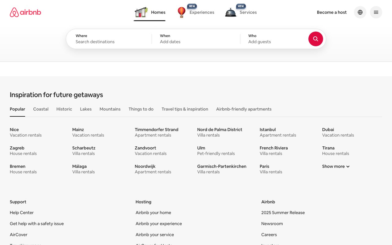
Design System Inspired by Airbnb
1. Visual Theme & Atmosphere
Airbnb's design system (DLS) is warm and human — the coral-red brand color evokes hospitality and belonging. Photography is the product. The system balances discovery browsing with the trust signals needed for booking: reviews, host identity, and transparent pricing.
Key Characteristics:
- Coral-red on white — warm, hospitable
- Photography-first: images carry the product
- Cereal typeface for a friendly, distinctive voice
- Trust signals (ratings, reviews, host photos) as first-class UI
2. Color Palette & Roles
Primary
- Rausch (
#FF5A5F): Brand coral, search bars, key UI moments - Arches (
#FC642D): CTA orange — Book button, primary actions
Accent Colors
- Babu (
#00A699): Teal — Experiences, secondary brand moments
Neutral Scale
- Text Primary (
#222222): Headings, prices, key info - Text Secondary (
#717171): Descriptions, secondary info - Text Muted (
#B0B0B0): Placeholders, disabled
Surface & Borders
- Background (
#FFFFFF): Page background - Surface (
#F7F7F7): Search bar bg, filter chips bg - Border (
#DDDDDD): Card borders, dividers
Semantic / Status
- Success (
#008A05): Confirmed bookings - Error (
#C13515): Errors, unavailable - Warning (
#C47600): Pending, review needed - Superhost (
#FF5A5F): Superhost badge (uses brand coral)
3. Typography Rules
Font Family
Primary: Cereal, fallback: Circular, -apple-system, sans-serif
Hierarchy
| Role | Font | Size | Weight | Line Height | Letter Spacing | Notes |
|---|---|---|---|---|---|---|
| Display | Cereal | 40px | 700 | 1.1 | -0.01em | Marketing hero |
| H1 | Cereal | 32px | 600 | 1.2 | 0 | Search results title |
| H2 | Cereal | 24px | 600 | 1.3 | 0 | Section headings |
| H3 | Cereal | 18px | 600 | 1.4 | 0 | Card titles |
| Body | Cereal | 16px | 400 | 1.5 | 0 | Descriptions |
| Price | Cereal | 16px | 600 | 1.3 | 0 | Pricing display |
| Caption | Cereal | 14px | 400 | 1.4 | 0 | Meta, dates |
| Legal | Cereal | 12px | 400 | 1.4 | 0 | Terms, footnotes |
Principles
- Cereal is warm and rounded — it signals hospitality
- Price display is always 600 weight to stand out
4. Component Stylings
Buttons
- Book (Primary): bg
#FF5A5Fgradient to#E51B5A, text#FFFFFF, padding14px 24px, radius8px, font 16px/600 - Secondary: bg
#FFFFFF, border1px solid #222222, text#222222 - Ghost: bg
transparent, text#222222, hover bg#F7F7F7
Cards & Containers
- Listing card: no border, radius
12px, image fills top, padding0 - Content below image: padding
8px 0, no card bg
Inputs & Forms
- Search bar: bg
#FFFFFF, border1px solid #DDDDDD, radius32px, padding14px 20px, shadow on focus - Date inputs: inline calendar widget
Navigation
- Sticky top bar,
#FFFFFF, height 80px, subtle bottom shadow on scroll - Logo left, search center, profile/host links right
5. Layout Principles
Spacing System
- 8px — Rating star gap
- 12px — Card metadata spacing
- 16px — Content block gaps
- 24px — Grid gaps between cards
- 32px — Section breaks
- 48px — Page sections
- 64px — Hero areas
Grid & Container
- Listing grid: 1/2/3/4 columns depending on viewport. 24px gutters.
- Listing page: 60% content + 40% booking widget at desktop.
Whitespace Philosophy
Let photography breathe — cards have zero background color to keep focus on images.
Border Radius Scale
- None (0px): Full-bleed listing page hero
- Sm (4px): Rating, badge labels
- Md (8px): Buttons, filter chips
- Lg (12px): Listing cards
- Full (9999px): Search bar (pill), avatars
6. Depth & Elevation
| Level | Treatment | Use |
|---|---|---|
| Flat | none | Listing cards (no bg) |
| Nav raised | 0 1px 2px rgba(0,0,0,0.08) | Scrolled top nav |
| Search focus | 0 6px 20px rgba(0,0,0,0.15) | Active search bar |
| Booking widget | 0 6px 16px rgba(0,0,0,0.12) | Sticky book card |
7. Do's and Don'ts
Do
- Lead with photography — images are the product
- Show price-per-night prominently with the /night denomination
- Use coral for brand identity; orange for the primary booking CTA
Don't
- Don't clutter listing cards with text — image + price + rating only
- Don't use Rausch (coral) for error states — it's the brand color
- Don't hide the host's photo — it's a core trust element
8. Responsive Behavior
Breakpoints
| Name | Width | Key Changes |
|---|---|---|
| Mobile | 0–743px | Single column grid, bottom sticky book bar |
| Tablet | 744–1127px | 2-column grid |
| Desktop | 1128px+ | 3–4 column grid + booking widget |
Touch Targets
Minimum 44×44px. Heart (save) button is 44×44px.
Collapsing Strategy
Booking widget becomes bottom sticky bar on mobile. Grid reduces to 1 column.
9. Agent Prompt Guide
Quick Color Reference
- Brand Coral: Rausch (
#FF5A5F) - Primary CTA: Arches (
#FC642D) - Background: White (
#FFFFFF) - Text:
#222222 - Secondary text:
#717171 - Border:
#DDDDDD
Iteration Guide
- Listing cards have no background color — they're image + text on white
- Search bar is pill-shaped with border-radius 32px
- Coral (#FF5A5F) is for brand; orange (#FC642D) is for the Book CTA
- Host avatar is always shown — it's a trust signal, not optional
- Price always shows "/night" denomination in secondary text