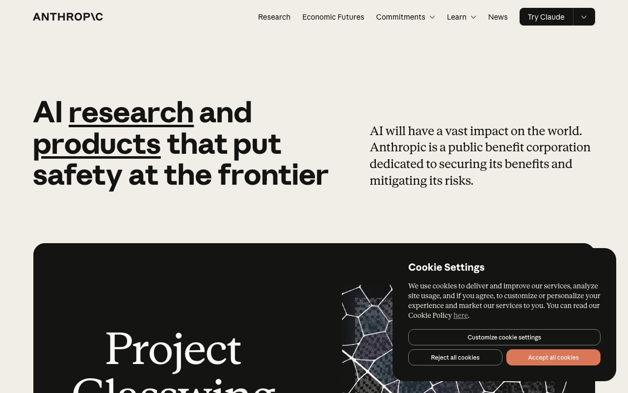
Anthropic
AI safety company behind Claude
Brand accent, headline tinting, subtle CTAs
Hover states
Secondary brand moments, callouts
Body and headings on dark
Captions, metadata
Placeholders, disabled
Dark page background
Cards, panels
Light mode sections
Dark mode dividers
Successful API calls
API errors, failures
Rate limit warnings
Informational notices
Design System Inspired by Anthropic
1. Visual Theme & Atmosphere
Anthropic's design is editorial and warm — a sand/terracotta palette on near-black creates a human, considered aesthetic unlike the cold blues typical of AI companies. The typographic system leans into serif display faces that evoke depth, research, and intellectual care.
Key Characteristics:
- Warm sand-terracotta on near-black
- Serif display typography signals thoughtfulness
- Muted, intentional palette — never saturated or flashy
- Generous margins and reading-optimised prose widths
2. Color Palette & Roles
Primary
- Sand (
#D4A574): Brand accent, headline tinting, subtle CTAs - Sand Dark (
#B8895A): Hover states
Accent Colors
- Terracotta (
#C17A56): Secondary brand moments, callouts
Neutral Scale
- Text Primary (
#EBEBEB): Body and headings on dark - Text Secondary (
#8B8B8B): Captions, metadata - Text Muted (
#5A5A5A): Placeholders, disabled
Surface & Borders
- Background (
#1A1A1A): Dark page background - Surface (
#2D2D2D): Cards, panels - Surface Light (
#FAF8F5): Light mode sections - Border (
#3A3A3A): Dark mode dividers
Semantic / Status
- Success (
#4ADE80): Successful API calls - Error (
#F87171): API errors, failures - Warning (
#FBBF24): Rate limit warnings - Info (
#60A5FA): Informational notices
3. Typography Rules
Font Family
Display: Tiempos Headline (serif). Body: Inter, fallback: system-ui. Code: Berkeley Mono
Hierarchy
| Role | Font | Size | Weight | Line Height | Letter Spacing | Notes |
|---|---|---|---|---|---|---|
| Display | Tiempos | 56px | 500 | 1.1 | -0.02em | Hero headlines |
| H1 | Tiempos | 40px | 500 | 1.2 | -0.01em | Page titles |
| H2 | Tiempos | 28px | 500 | 1.3 | 0 | Section headings |
| H3 | Inter | 20px | 600 | 1.4 | 0 | Sub-sections |
| Body | Inter | 17px | 400 | 1.75 | 0 | Research prose |
| Caption | Inter | 14px | 400 | 1.5 | 0 | Meta, tags |
| Code | Berkeley Mono | 14px | 400 | 1.6 | 0 | Technical content |
Principles
- Serif display + sans body creates a research paper aesthetic
- Body width never exceeds 700px — Anthropic prioritises reading comfort
4. Component Stylings
Buttons
- Primary: bg
transparent, border1px solid #D4A574, text#D4A574, padding10px 24px, radius4px - Filled: bg
#D4A574, text#1A1A1A, same padding - Ghost: bg
transparent, text#EBEBEB, no border, hover text#D4A574
Cards & Containers
- bg
#2D2D2D, border1px solid #3A3A3A, radius8px, padding24px - Research cards: serif headline, author + date metadata below
Inputs & Forms
- bg
#2D2D2D, border1px solid #3A3A3A, radius4px, padding10px 16px, text#EBEBEB - Focus: border
#D4A574
Navigation
- Minimal top nav
#1A1A1A, height 64px - Logo left, nav links right with generous spacing
5. Layout Principles
Spacing System
- 8px — Tight element gaps
- 16px — Component padding
- 24px — Card padding
- 32px — Section gaps
- 48px — Content blocks
- 64px — Page sections
- 96px — Major page breaks
Grid & Container
- Max width 1100px. Reading width max 700px. 12-column grid with 24px gutters.
Whitespace Philosophy
Anthropic uses generous whitespace as a signal of intellectual seriousness.
Border Radius Scale
- None (0px): Horizontal rules, full-width sections
- Sm (4px): Buttons, tags
- Md (8px): Cards
- Full (9999px): Avatars, topic chips
6. Depth & Elevation
| Level | Treatment | Use |
|---|---|---|
| Flat | none | Page, article surfaces |
| Raised | 0 1px 4px rgba(0,0,0,0.3) | Research cards |
| Overlay | 0 8px 24px rgba(0,0,0,0.4) | Modals |
Anthropic uses minimal elevation — the design is intentionally flat.
7. Do's and Don'ts
Do
- Use Tiempos for all display and research headlines
- Keep sand/terracotta as accents — never flood backgrounds with it
- Maintain generous line heights for all body copy
Don't
- Don't use bright or saturated colors
- Don't use rounded or playful UI elements — the aesthetic is serious
- Don't compress body text below 700px width
8. Responsive Behavior
Breakpoints
| Name | Width | Key Changes |
|---|---|---|
| Mobile | 0–767px | Single column, full-width cards |
| Tablet | 768–1023px | 2-column grid |
| Desktop | 1024px+ | Full layout with margins |
Touch Targets
Minimum 44×44px. Navigation links have 48px tap zone.
Collapsing Strategy
Nav collapses to hamburger. Research grid goes single column. Body stays full width.
9. Agent Prompt Guide
Quick Color Reference
- Brand Accent: Sand (
#D4A574) - Background: Near-black (
#1A1A1A) - Surface: Dark gray (
#2D2D2D) - Text:
#EBEBEB - Border:
#3A3A3A - Display font: Tiempos (serif)
Iteration Guide
- Tiempos at weight 500 — never bold for display text
- Sand is an accent, not a background fill — use sparingly
- Body prose max 700px — enforce this constraint
- Buttons are outlined by default — filled only for primary CTA
- No gradients, no animations, no decorative shapes