Apple
Think different
Links, CTA buttons, interactive states
Hover state
All headings and body
Captions, footnotes
Placeholder, disabled
Primary page background
Section backgrounds, alternating rows
Light dividers
Product hero sections
iOS-style success (rare on web)
iOS-style error (rare on web)
All clickable elements
Design System Inspired by Apple
1. Visual Theme & Atmosphere
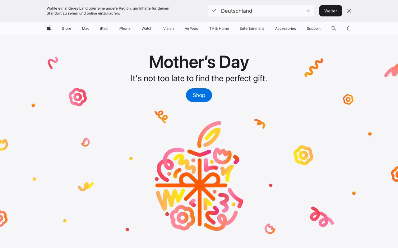
Apple's design system is the global benchmark for premium digital minimalism. Pure white and near-black with a single blue for interactivity. Every pixel is intentional. Photography and video carry the experience — the UI disappears so the product can speak.
Key Characteristics:
- White and F5F5F7 surfaces with blue as the only interactive color
- SF Pro — Apple's proprietary typeface optimised for Retina
- Product photography as the primary design element
- Aggressive whitespace and restraint
2. Color Palette & Roles
Primary
- Blue (
#0071E3): Links, CTA buttons, interactive states - Blue Dark (
#0055C6): Hover state
Accent Colors
- None — Apple uses no secondary brand color in product marketing
Neutral Scale
- Text Primary (
#1D1D1F): All headings and body - Text Secondary (
#6E6E73): Captions, footnotes - Text Tertiary (
#AEAEB2): Placeholder, disabled
Surface & Borders
- Background (
#FFFFFF): Primary page background - Surface (
#F5F5F7): Section backgrounds, alternating rows - Border (
#D2D2D7): Light dividers - Dark BG (
#000000): Product hero sections
Semantic / Status
- Success (
#34C759): iOS-style success (rare on web) - Error (
#FF3B30): iOS-style error (rare on web) - Blue Link (
#0071E3): All clickable elements
3. Typography Rules
Font Family
Display: SF Pro Display. Text: SF Pro Text. Fallback: -apple-system, BlinkMacSystemFont, sans-serif
Hierarchy
| Role | Font | Size | Weight | Line Height | Letter Spacing | Notes |
|---|---|---|---|---|---|---|
| Hero | SF Pro Display | 80px | 700 | 1.05 | -0.02em | Product hero |
| H1 | SF Pro Display | 56px | 600 | 1.1 | -0.01em | Feature headline |
| H2 | SF Pro Display | 40px | 500 | 1.15 | 0 | Section heading |
| H3 | SF Pro Display | 28px | 500 | 1.2 | 0 | Sub-section |
| Body | SF Pro Text | 17px | 400 | 1.6 | 0 | Spec text, prose |
| Caption | SF Pro Text | 12px | 400 | 1.4 | 0 | Footnotes, legal |
| Price | SF Pro Display | 22px | 500 | 1.2 | 0 | Product pricing |
Principles
- SF Pro Display for 20px+ headings; SF Pro Text for body
- Never more than two weight levels on one page
4. Component Stylings
Buttons
- Primary: bg
#0071E3, text#FFFFFF, padding12px 24px, radius980px(pill), font 17px/500 - Secondary: bg
transparent, text#0071E3, no border — text-only link style - No border treatments — Apple buttons are filled or plain text
Cards & Containers
- bg
#F5F5F7, no border, radius18px, padding40px - Product tiles: square or 4:3, product image fills card
Inputs & Forms
- Border
1px solid #D2D2D7, radius10px, padding12px 16px, font SF Pro Text 17px - Focus: border
#0071E3
Navigation
- Sticky top nav,
rgba(255,255,255,0.85)backdrop blur, height 44px - Logo centered or left, nav links spaced right
5. Layout Principles
Spacing System
- 8px — Icon-label gaps
- 16px — Compact section padding
- 24px — Content blocks
- 40px — Card padding
- 64px — Section gaps
- 96px — Major page sections
- 128px — Hero areas
Grid & Container
- Max width 980px for product pages, 1200px for grid. 12-column, 20px gutters.
Whitespace Philosophy
Whitespace is the primary design element — Apple uses more of it than anyone else.
Border Radius Scale
- None (0px): Full-bleed images
- Sm (10px): Inputs, small cards
- Md (18px): Feature cards, product tiles
- Lg (28px): Large feature sections
- Full (9999px): CTA buttons (pill shape)
6. Depth & Elevation
| Level | Treatment | Use |
|---|---|---|
| Flat | none | Page surface |
| Nav | backdrop-filter: blur(20px) | Sticky nav on scroll |
| Card | subtle inner shadow | Product tiles |
| Modal | 0 40px 80px rgba(0,0,0,0.2) | Dialogs |
Apple rarely uses drop shadows — blur and surface contrast replace them.
7. Do's and Don'ts
Do
- Use white space aggressively — it communicates premium
- Let product photography dominate every page
- Use pill buttons (
radius: 980px) for all primary CTAs
Don't
- Don't use more than two font weights on one page
- Don't add borders or shadows to cards — use surface contrast
- Don't use any color other than blue for interactive elements
8. Responsive Behavior
Breakpoints
| Name | Width | Key Changes |
|---|---|---|
| Mobile | 0–767px | Single column, smaller headlines |
| Tablet | 768–1023px | 2-column product grid |
| Desktop | 1024px+ | Full layout, 3-column grid |
Touch Targets
Minimum 44×44px (Apple's own HIG standard). Nav items are 44px tall.
Collapsing Strategy
Nav collapses to hamburger. Product grid goes 1–2 columns. Hero headlines scale via clamp().
9. Agent Prompt Guide
Quick Color Reference
- Interactive: Blue (
#0071E3) - Background: White (
#FFFFFF) - Section bg:
#F5F5F7 - Dark hero bg: Black (
#000000) - Text:
#1D1D1F - Secondary text:
#6E6E73
Iteration Guide
- Buttons are pill-shaped (radius 980px) — not rectangular
- No secondary brand color — blue is the only interactive color
- SF Pro falls back to -apple-system — never use a substitute
- Product tiles are always square or 4:3 with full-bleed images
- Page max-width is 980px — narrower than most