Atlassian
Teamwork tools that unlock potential
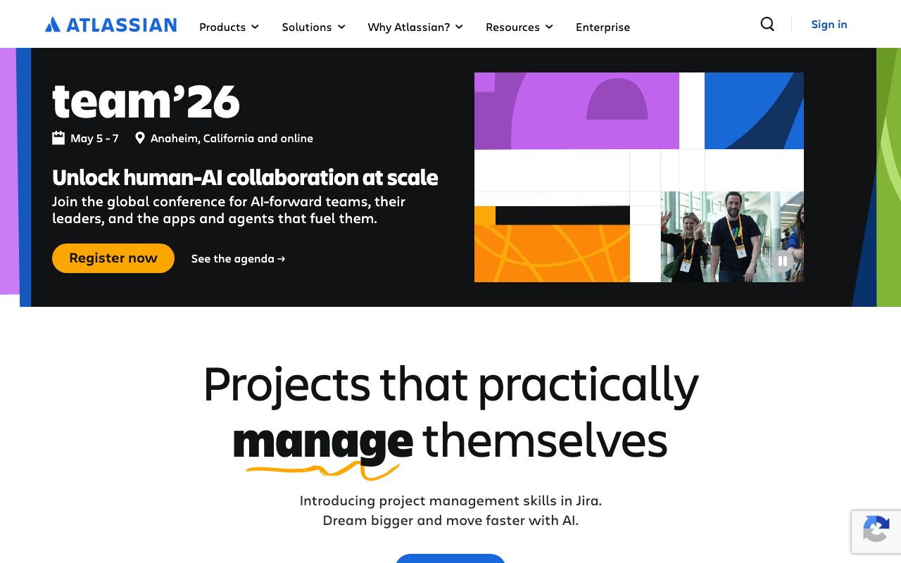
Primary CTAs, links, active nav
Hover state
Discovery, secondary highlights
Epics, high-level items
Headings, primary body
Metadata, captions
Placeholders, disabled
App background
Cards, panels
Dividers, input borders
Section borders
Done, merged, resolved
In-progress, at-risk
Blocked, failed
Informational notices
Design System Inspired by Atlassian
1. Visual Theme & Atmosphere
Atlassian's design system (ADS) is built for enterprise teamwork — structured, trustworthy, and scalable. The signature cobalt blue signals reliability and professionalism. The system serves Jira, Confluence, Trello, and Bitbucket through a rigorous shared token system.
Key Characteristics:
- Cobalt blue as the trust anchor
- Enterprise-grade information density
- Charlie Display headlines, system fonts for body
- Flat, purposeful, zero-decoration aesthetic
2. Color Palette & Roles
Primary
- Brand Blue (
#0052CC): Primary CTAs, links, active nav - Blue Hover (
#0065FF): Hover state
Accent Colors
- Teal (
#00B8D9): Discovery, secondary highlights - Purple (
#6554C0): Epics, high-level items
Neutral Scale
- Text Primary (
#172B4D): Headings, primary body - Text Secondary (
#5E6C84): Metadata, captions - Text Muted (
#7A869A): Placeholders, disabled
Surface & Borders
- Background (
#F4F5F7): App background - Surface (
#FFFFFF): Cards, panels - Border (
#DFE1E6): Dividers, input borders - Border Strong (
#C1C7D0): Section borders
Semantic / Status
- Success (
#00875A): Done, merged, resolved - Warning (
#FF991F): In-progress, at-risk - Error (
#DE350B): Blocked, failed - Info (
#0052CC): Informational notices
3. Typography Rules
Font Family
Primary: Charlie Display (headings), -apple-system / BlinkMacSystemFont (body). Fallback: sans-serif
Hierarchy
| Role | Font | Size | Weight | Line Height | Letter Spacing | Notes |
|---|---|---|---|---|---|---|
| Display | Charlie Display | 36px | 700 | 1.1 | -0.01em | Feature titles |
| H1 | Charlie Display | 29px | 700 | 1.2 | 0 | Page titles |
| H2 | Charlie Display | 24px | 600 | 1.3 | 0 | Section headings |
| H3 | System | 20px | 600 | 1.4 | 0 | Card headings |
| Body | System | 14px | 400 | 1.6 | 0 | UI body text |
| Small | System | 12px | 400 | 1.5 | 0 | Metadata, labels |
| Button | System | 14px | 500 | 1 | 0.01em | CTA labels |
| Code | Mono | 12px | 400 | 1.6 | 0 | Code, issue IDs |
Principles
- Density over decoration — enterprise users scan, not read
- Consistent 14px body across all Atlassian products
4. Component Stylings
Buttons
- Primary: bg
#0052CC, text#FFFFFF, padding8px 12px, radius3px, font 14px/500 - Secondary: bg
transparent, border2px solid #0052CC, text#0052CC - Subtle: bg
transparent, text#172B4D, hover bg#F4F5F7 - Danger: bg
#DE350B, text#FFFFFF
Cards & Containers
- bg
#FFFFFF, border1px solid #DFE1E6, radius3px, padding16px
Inputs & Forms
- Border
2px solid #DFE1E6, radius3px, padding8px 6px - Focus: border
#0052CC
Navigation
- Left sidebar
#0747A6dark blue, 240px, white text and icons - Top bar
#0052CC, 56px
5. Layout Principles
Spacing System
- 4px — Tight element gaps
- 8px — Icon-label gaps, compact padding
- 12px — Button padding, list items
- 16px — Card padding, form fields
- 24px — Section gaps
- 32px — Component separation
- 40px — Page-level sections
Grid & Container
- Max width 1280px. Sidebar 240px + fluid main. 8-column content grid, 16px gutters.
Whitespace Philosophy
Atlassian products are data-heavy. Whitespace groups related information, not decorates.
Border Radius Scale
- None (0px): Table cells, status lozenges
- Sm (3px): Buttons, inputs, cards, badges
- Md (8px): Modals, dialogs
- Full (9999px): Avatars, team chips
6. Depth & Elevation
| Level | Treatment | Use |
|---|---|---|
| Flat | none | Default cards, tables |
| Raised | 0 1px 1px rgba(9,30,66,0.25), 0 0 1px rgba(9,30,66,0.31) | Inline cards |
| Overlay | 0 4px 8px -2px rgba(9,30,66,0.25), 0 0 1px rgba(9,30,66,0.31) | Dropdowns |
| Modal | 0 8px 16px -4px rgba(9,30,66,0.25), 0 0 1px rgba(9,30,66,0.31) | Dialogs |
7. Do's and Don'ts
Do
- Use the lozenge component for status labels
- Reserve blue for primary interactive actions only
- Follow the 3px radius rule — Atlassian is tighter than most
Don't
- Don't use more than 4 colors on a single screen
- Don't deviate from the sidebar navigation pattern
- Don't use Charlie Display below 20px
8. Responsive Behavior
Breakpoints
| Name | Width | Key Changes |
|---|---|---|
| Mobile | 0–767px | Hidden sidebar, bottom nav |
| Tablet | 768–1023px | Collapsible sidebar |
| Desktop | 1024px+ | Full sidebar, persistent nav |
Touch Targets
Minimum 44×44px. Board cards have 48px touch area.
Collapsing Strategy
Sidebar collapses to icon-only rail at tablet. Kanban boards scroll horizontally.
9. Agent Prompt Guide
Quick Color Reference
- Primary CTA: Brand Blue (
#0052CC) - Background: App Gray (
#F4F5F7) - Heading text: Dark Navy (
#172B4D) - Border: Light Gray (
#DFE1E6) - Success: Green (
#00875A) - Error: Red (
#DE350B)
Iteration Guide
- Radius is 3px — tighter than almost any other SaaS product
- Body text is 14px throughout — never 16px in the app shell
- Nav sidebar is
#0747A6, not brand blue#0052CC - Status lozenges are pill-shaped with category-specific colors
- Shadows use
rgba(9,30,66,...)base — their signature dark navy