Axiom
Monitor everything. Store everything
CTAs, active states, chart primary
Hover state
Links, info states, secondary charts
Headings, body
Metadata, labels
Placeholders, disabled
App background
Cards, panels
Input fields
Dividers
Debug log entries
Info log entries
Warning log entries
Error log entries
Design System Inspired by Axiom
1. Visual Theme & Atmosphere
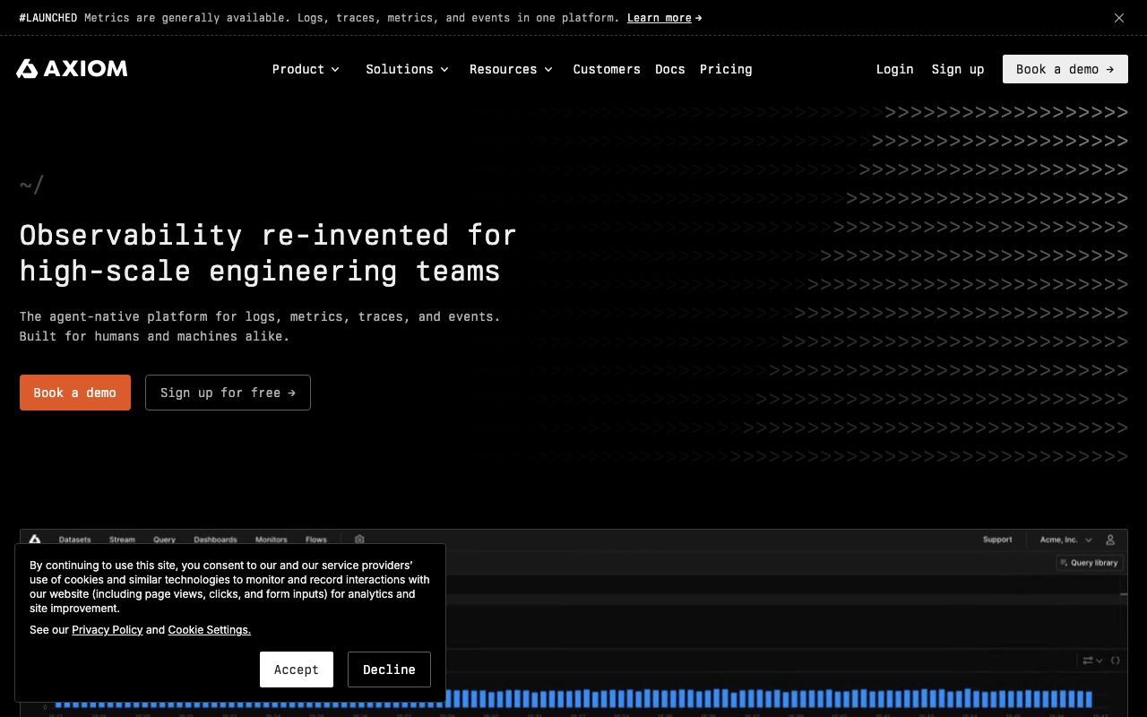
Axiom is an observability platform for logs, traces, and metrics. A vivid purple accent on deep near-black surfaces creates a premium monitoring environment. Purple differentiates Axiom in a market dominated by blues and greens, signalling innovative thinking about data.
Key Characteristics:
- Vivid purple on near-black — distinctive in the observability space
- Dense log and trace interfaces
- SF Mono for terminal-native engineers
- Always dark — monitoring happens around the clock
2. Color Palette & Roles
Primary
- Brand Purple (
#AE4DFF): CTAs, active states, chart primary - Purple Dark (
#8B2FE0): Hover state
Accent Colors
- Blue (
#4F8EF7): Links, info states, secondary charts
Neutral Scale
- Text Primary (
#EAEAF0): Headings, body - Text Secondary (
#8B8D97): Metadata, labels - Text Muted (
#5A5C66): Placeholders, disabled
Surface & Borders
- Background (
#0B0C0F): App background - Surface (
#1C1D22): Cards, panels - Surface Raised (
#27282F): Input fields - Border (
#35363D): Dividers
Semantic / Status
- Debug (
#8B8D97): Debug log entries - Info (
#4F8EF7): Info log entries - Warn (
#F59E0B): Warning log entries - Error (
#EF4444): Error log entries
3. Typography Rules
Font Family
Primary: Inter, fallback: system-ui, sans-serif. Code: SF Mono (Mac) / Cascadia Code (Win)
Hierarchy
| Role | Font | Size | Weight | Line Height | Letter Spacing | Notes |
|---|---|---|---|---|---|---|
| H1 | Inter | 28px | 700 | 1.2 | -0.01em | Dashboard title |
| H2 | Inter | 20px | 600 | 1.3 | 0 | Section headings |
| H3 | Inter | 16px | 600 | 1.4 | 0 | Widget titles |
| Body | Inter | 14px | 400 | 1.6 | 0 | UI body |
| Log | SF Mono | 13px | 400 | 1.5 | 0 | Log stream text |
| Small | Inter | 12px | 400 | 1.4 | 0 | Timestamps, meta |
Principles
- Monospace for all log content — variable-width fonts break log scanning
- Dense row height (24px) in log streams
4. Component Stylings
Buttons
- Primary: bg
#AE4DFF, text#FFFFFF, padding8px 16px, radius6px, font 14px/600 - Secondary: bg
transparent, border1px solid #35363D, text#EAEAF0 - Danger: bg
#EF4444, text#FFFFFF
Cards & Containers
- bg
#1C1D22, border1px solid #35363D, radius8px, padding16px
Inputs & Forms
- bg
#27282F, border1px solid #35363D, radius6px, padding8px 12px, text#EAEAF0 - Focus: border
#AE4DFF
Navigation
- Left sidebar
#0B0C0F, 240px - Top nav
#0B0C0F, 48px, border-bottom#1C1D22
5. Layout Principles
Spacing System
- 4px — Log entry padding
- 8px — Field chips
- 12px — Widget padding
- 16px — Card padding
- 24px — Section gaps
- 32px — Dashboard row gaps
- 48px — Page sections
Grid & Container
- Dashboard: 12-column grid, max 1440px. Tiles drag-to-resize.
Whitespace Philosophy
Log interfaces are necessarily dense — use whitespace only between dashboard tiles.
Border Radius Scale
- None (0px): Log rows, table cells
- Sm (4px): Severity badges, tags
- Md (6px): Buttons, inputs
- Lg (8px): Cards, tiles
- Full (9999px): Dataset chips
6. Depth & Elevation
| Level | Treatment | Use |
|---|---|---|
| Flat | none | Background |
| Raised | 0 0 0 1px rgba(255,255,255,0.05) | Cards |
| Overlay | 0 4px 20px rgba(0,0,0,0.6) | Dropdowns |
| Modal | 0 8px 40px rgba(0,0,0,0.7) | Dialogs |
7. Do's and Don'ts
Do
- Use 4 fixed severity colors for logs: gray/blue/amber/red
- Keep purple for brand and interactive elements only
- Show timestamps in user's local timezone by default
Don't
- Don't use purple for severity levels
- Don't truncate log messages without expand
- Don't auto-refresh dashboards faster than 5s
8. Responsive Behavior
Breakpoints
| Name | Width | Key Changes |
|---|---|---|
| Mobile | 0–767px | Log stream only, no dashboard |
| Tablet | 768–1023px | 2-column dashboard, collapsed nav |
| Desktop | 1024px+ | Full dashboard |
Touch Targets
Minimum 44×44px. Log rows are 24px but have 44px tap zone via padding.
Collapsing Strategy
Sidebar collapses to icon strip. Log filters move to a bottom sheet on mobile.
9. Agent Prompt Guide
Quick Color Reference
- CTA: Purple (
#AE4DFF) - Background:
#0B0C0F - Surface:
#1C1D22 - Text:
#EAEAF0 - Debug logs: Gray (
#8B8D97) - Info logs: Blue (
#4F8EF7) - Warn logs: Amber (
#F59E0B) - Error logs: Red (
#EF4444)
Iteration Guide
- Log severity uses 4 colors — never use purple for any severity level
- All log content is monospace — SF Mono preferred
- Cards are
#1C1D22, one step lighter than#0B0C0Fbg - Purple focus ring:
0 0 0 3px rgba(174,77,255,0.3) - Dashboard tiles are resizable — avoid fixed pixel widths in tile content