Cal.com
Scheduling infrastructure for the modern web
13 colors
17 components
Inter
Mar 26, 2026
Website Preview
Colors
Primary
#292929
Primary dark
#FFFFFF
Background
#FF7A45
Orange accent, CTAs
#F3F4F6
Muted surfaces
#6B7280
Secondary text
Neutral
#111827
Dark headings
#374151
Body text
#9CA3AF
Placeholder text
#E5E7EB
Borders, dividers
#F9FAFB
Background tints
Semantic
#22C55E
Booked, confirmed state
#EF4444
Unavailable, error states
#F59E0B
Pending, tentative states
Typography
Inter
Role
SizeWeightHeight
Heading
30px7001.2
Subheading
20px6001.3
Body
16px4001.6
Small
14px4001.5
Caption
12px4001.4
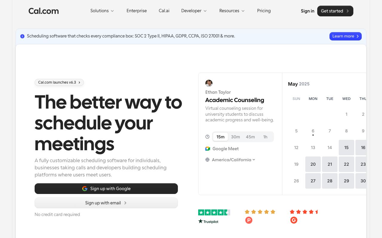
DESIGN.md — Cal.com
Overview
Cal.com's design system is grounded in accessibility and clarity. A near-black primary color with orange accent creates warmth in a scheduling context. The open-source nature is reflected in clean, well-documented, themeable components.
Colors
Primary Palette
| Token | Hex | Usage |
|---|---|---|
color-brand | #292929 | Primary dark |
color-bg | #FFFFFF | Background |
color-accent | #FF7A45 | Orange accent, CTAs |
color-muted-bg | #F3F4F6 | Muted surfaces |
color-muted | #6B7280 | Secondary text |
Neutral Palette
| Token | Hex | Usage |
|---|---|---|
color-gray-900 | #111827 | Dark headings |
color-gray-700 | #374151 | Body text |
color-gray-400 | #9CA3AF | Placeholder text |
color-gray-200 | #E5E7EB | Borders, dividers |
color-gray-50 | #F9FAFB | Background tints |
Semantic Colors
| Token | Hex | Usage |
|---|---|---|
color-success | #22C55E | Booked, confirmed state |
color-error | #EF4444 | Unavailable, error states |
color-warning | #F59E0B | Pending, tentative states |
Typography
| Role | Family | Size | Weight | Line Height |
|---|---|---|---|---|
| Heading | Inter | 30px | 700 | 1.2 |
| Subheading | Inter | 20px | 600 | 1.3 |
| Body | Inter | 16px | 400 | 1.6 |
| Small | Inter | 14px | 400 | 1.5 |
| Caption | Inter | 12px | 400 | 1.4 |
Spacing
| Token | Value | Usage |
|---|---|---|
space-1 | 4px | Inline gaps |
space-2 | 8px | Form element gaps |
space-4 | 16px | Card padding |
space-6 | 24px | Section gaps |
space-8 | 32px | Page sections |
Border Radius
| Token | Value | Usage |
|---|---|---|
radius-sm | 4px | Duration pills |
radius-md | 8px | Inputs, buttons |
radius-lg | 12px | Cards, modals |
radius-full | 9999px | Avatar, pill tags |
Elevation
| Level | Value | Usage |
|---|---|---|
shadow-sm | 0 1px 2px rgba(0,0,0,0.05) | Input fields |
shadow-md | 0 4px 12px rgba(0,0,0,0.08) | Calendar popover |
shadow-lg | 0 8px 24px rgba(0,0,0,0.12) | Booking modal |
Components
Calendar Grid
- 7-column date grid
- Available slots highlighted in brand color
- Time zone selector in header
Booking Form
- Name, email, notes fields
- Duration selector pills
- Confirm button in orange accent
Availability Card
- Weekly schedule view
- Draggable time blocks
- Override dates support
Do's and Don'ts
Do
- Use the orange accent for primary booking actions
- Show time zones prominently
- Keep forms short — minimize required fields
Don't
- Don't use red for available time slots
- Don't auto-select time zones without confirmation
- Don't hide calendar navigation