Clerk
Authentication and user management for the modern web
13 colors
19 components
Inter
Mar 22, 2026
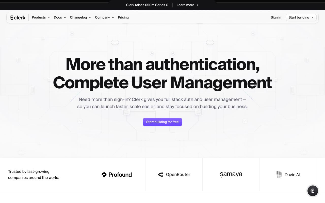
Website Preview
Colors
Primary
#6C47FF
Primary purple
#131316
App background
#1F0256
Purple-tinted surface
#FFFFFF
Primary text
#F4F0FF
Light mode surfaces
Neutral
#131316
App background
#1E1E26
Card surfaces
#3D3D50
Borders
#7C7C99
Muted text
#E8E8F0
Light surfaces
Semantic
#16A34A
Verified, authenticated states
#DC2626
Auth errors, invalid input
#D97706
Session expiry warnings
Typography
Inter
Role
SizeWeightHeight
Display
48px7001.1
Heading
32px6001.2
Body
16px4001.6
Label
13px5001.4
Caption
12px4001.4
DESIGN.md — Clerk
Overview
Clerk's design system bridges developer tooling and end-user polish. A deep purple accent on near-black surfaces creates a premium, security-focused feel. The auth components are designed to be both embeddable and beautiful out of the box.
Colors
Primary Palette
| Token | Hex | Usage |
|---|---|---|
color-brand | #6C47FF | Primary purple |
color-bg | #131316 | App background |
color-surface | #1F0256 | Purple-tinted surface |
color-text | #FFFFFF | Primary text |
color-light | #F4F0FF | Light mode surfaces |
Neutral Palette
| Token | Hex | Usage |
|---|---|---|
color-gray-950 | #131316 | App background |
color-gray-800 | #1E1E26 | Card surfaces |
color-gray-600 | #3D3D50 | Borders |
color-gray-400 | #7C7C99 | Muted text |
color-gray-100 | #E8E8F0 | Light surfaces |
Semantic Colors
| Token | Hex | Usage |
|---|---|---|
color-success | #16A34A | Verified, authenticated states |
color-error | #DC2626 | Auth errors, invalid input |
color-warning | #D97706 | Session expiry warnings |
Typography
| Role | Family | Size | Weight | Line Height |
|---|---|---|---|---|
| Display | Inter | 48px | 700 | 1.1 |
| Heading | Inter | 32px | 600 | 1.2 |
| Body | Inter | 16px | 400 | 1.6 |
| Label | Inter | 13px | 500 | 1.4 |
| Caption | Inter | 12px | 400 | 1.4 |
Spacing
| Token | Value | Usage |
|---|---|---|
space-1 | 4px | Inline gaps |
space-2 | 8px | Field gaps |
space-4 | 16px | Form spacing |
space-6 | 24px | Card padding |
space-8 | 32px | Modal padding |
Border Radius
| Token | Value | Usage |
|---|---|---|
radius-sm | 6px | Inputs, buttons |
radius-md | 10px | Cards |
radius-lg | 16px | Sign-in modal |
radius-full | 9999px | Avatar, pill badges |
Elevation
| Level | Value | Usage |
|---|---|---|
shadow-sm | 0 1px 3px rgba(0,0,0,0.2) | Input fields |
shadow-md | 0 4px 16px rgba(108,71,255,0.15) | Auth card |
shadow-lg | 0 12px 40px rgba(0,0,0,0.4) | Full modal |
Components
Sign In Card
- Centered card, white bg, radius 16px
- Social providers (Google, GitHub, etc.)
- Email/password fields
- "Secured by Clerk" footer badge
User Button
- Avatar circle, click for dropdown
- Shows name, email, sign out option
- Customizable theme
Do's and Don'ts
Do
- Use purple as the single accent color
- Make auth flows feel secure with dark backgrounds
- Support both light and dark theme variants
Don't
- Don't use bright colors for non-interactive elements
- Don't reduce auth form padding below 24px
- Don't hide the security branding