Convex
The fullstack TypeScript development platform
CTAs, active states, brand moments
Hover state
Reactive/live indicators, query subscriptions
Headings, body
Labels, metadata
Placeholders
App background
Cards, editors
Input fields
Dividers
Write operations (amber)
Read subscriptions (blue)
Background functions (green)
Failures, schema errors
Design System Inspired by Convex
1. Visual Theme & Atmosphere
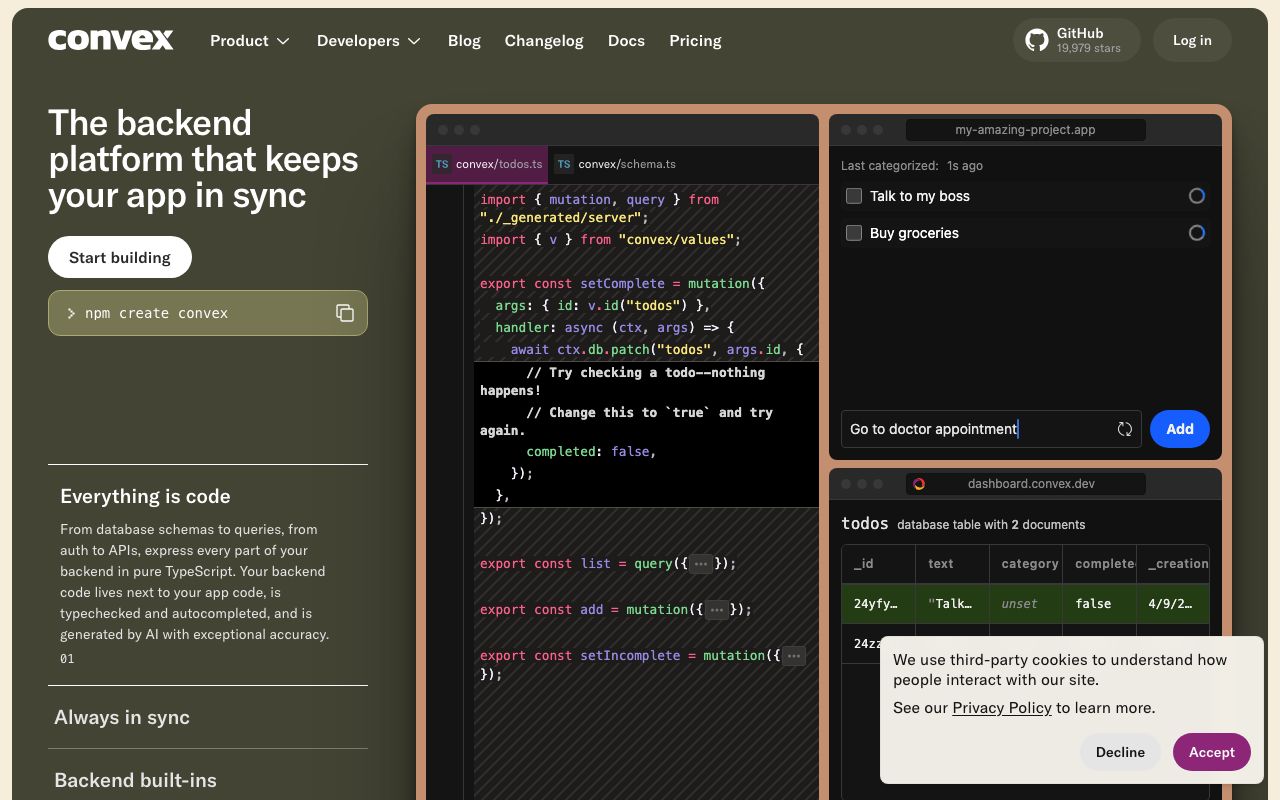
Convex is a fullstack reactive database platform. Warm amber-gold on deep purple-dark surfaces creates an inviting, premium developer experience that stands apart from the cold blues of typical developer tooling. The design emphasises real-time reactivity and TypeScript-first workflows.
Key Characteristics:
- Amber-gold accent on deep purple-dark
- Warm and inviting — uncommon in the DB tooling space
- Real-time data updates as a visual first-class citizen
- Inter and Fira Code for legible technical content
2. Color Palette & Roles
Primary
- Amber Gold (
#F3AD2E): CTAs, active states, brand moments - Amber Dark (
#D4921A): Hover state
Accent Colors
- Teal (
#2DD4BF): Reactive/live indicators, query subscriptions
Neutral Scale
- Text Primary (
#E8E8F0): Headings, body - Text Secondary (
#9999B0): Labels, metadata - Text Muted (
#5E5E7A): Placeholders
Surface & Borders
- Background (
#1E1E2E): App background - Surface (
#2D2D3F): Cards, editors - Surface Raised (
#38384F): Input fields - Border (
#44445A): Dividers
Semantic / Status
- Mutation (
#F3AD2E): Write operations (amber) - Query (
#4F8EF7): Read subscriptions (blue) - Action (
#22C55E): Background functions (green) - Error (
#EF4444): Failures, schema errors
3. Typography Rules
Font Family
Primary: Inter, fallback: system-ui, sans-serif. Code: Fira Code
Hierarchy
| Role | Font | Size | Weight | Line Height | Letter Spacing | Notes |
|---|---|---|---|---|---|---|
| H1 | Inter | 32px | 700 | 1.2 | -0.01em | Page titles |
| H2 | Inter | 22px | 600 | 1.3 | 0 | Section headings |
| H3 | Inter | 17px | 600 | 1.4 | 0 | Card titles |
| Body | Inter | 15px | 400 | 1.6 | 0 | UI body |
| Small | Inter | 13px | 400 | 1.5 | 0 | Labels, timestamps |
| Code | Fira Code | 14px | 400 | 1.6 | 0 | TypeScript, queries |
Principles
- Warm dark palette requires 15px body for comfortable reading
- Fira Code has good ligature support for TypeScript operators
4. Component Stylings
Buttons
- Primary: bg
#F3AD2E, text#1E1E2E, padding9px 18px, radius6px, font 14px/600 - Secondary: bg
transparent, border1px solid #44445A, text#E8E8F0 - Danger: bg
#EF4444, text#FFFFFF
Cards & Containers
- bg
#2D2D3F, border1px solid #44445A, radius8px, padding20px - Live-updating rows: left flash animation in amber
Inputs & Forms
- bg
#38384F, border1px solid #44445A, radius6px, padding9px 14px, text#E8E8F0 - Focus: border
#F3AD2E
Navigation
- Left sidebar
#1E1E2E, 240px - Top nav
#1E1E2E, 56px, border-bottom#2D2D3F
5. Layout Principles
Spacing System
- 4px — Icon gaps
- 8px — Chip spacing
- 12px — Compact padding
- 16px — Card padding
- 20px — Card content
- 24px — Section gaps
- 32px — Panel separation
- 48px — Page sections
Grid & Container
- Max width 1280px. Sidebar 240px + fluid content.
Whitespace Philosophy
Warm dark palette benefits from generous padding — don't compress the purple-dark surfaces.
Border Radius Scale
- None (0px): Code editor
- Sm (4px): Function type badges
- Md (6px): Buttons, inputs
- Lg (8px): Cards, document rows
- Full (9999px): Status indicators
6. Depth & Elevation
| Level | Treatment | Use |
|---|---|---|
| Flat | none | Background |
| Raised | 0 0 0 1px rgba(255,255,255,0.06) | Cards |
| Overlay | 0 4px 20px rgba(0,0,0,0.5) | Dropdowns |
| Modal | 0 8px 40px rgba(0,0,0,0.6) | Dialogs |
7. Do's and Don'ts
Do
- Use amber for write (mutation) operations — it signals change
- Show live data updates with subtle amber flash animations
- Colour-code function types: amber=mutation, blue=query, green=action
Don't
- Don't use amber for warning states — use a distinct orange-red
- Don't hide the function execution log
- Don't use light backgrounds anywhere in the dashboard
8. Responsive Behavior
Breakpoints
| Name | Width | Key Changes |
|---|---|---|
| Mobile | 0–767px | Sidebar hidden, bottom nav |
| Tablet | 768–1023px | Collapsed sidebar |
| Desktop | 1024px+ | Full sidebar + content |
Touch Targets
Minimum 44×44px. Document row actions are 40px with 4px padding.
Collapsing Strategy
Sidebar slides in on mobile. Data tables scroll horizontally.
9. Agent Prompt Guide
Quick Color Reference
- CTA: Amber Gold (
#F3AD2E) — text is dark (#1E1E2E) on amber - Background: Deep purple-dark (
#1E1E2E) - Surface: Card (
#2D2D3F) - Text:
#E8E8F0 - Mutation badge: Amber
- Query badge: Blue (
#4F8EF7) - Action badge: Green (
#22C55E)
Iteration Guide
- Amber CTA text must be
#1E1E2E— the amber is bright - Function type colors are fixed: amber/blue/green
- Live updates flash the row border in amber, then fade out
- Fira Code for all TypeScript and schema content
- The purple-dark bg is
#1E1E2E— warmer than typical dev tool dark