Cursor
The AI code editor
CTAs, links, active states
Hover state
AI/chat elements, suggestion highlights
Marketing page body
Editor text
Captions, metadata
Marketing bg
Editor bg
Editor panels
Marketing dividers
Editor borders
Accepted changes
Linting errors, rejected
Warnings
Design System Inspired by Cursor
1. Visual Theme & Atmosphere
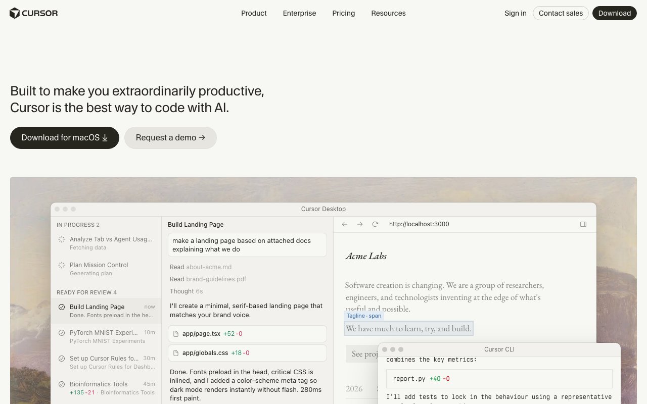
Cursor is an AI-powered code editor built on VS Code. A confident blue on white (marketing) and near-black (editor) creates a clean, focused environment. The design bridges the familiar IDE aesthetic with a conversational AI interface layered alongside the code canvas.
Key Characteristics:
- Bright blue on white for marketing; dark canvas for the editor
- Geist typeface — purpose-built for code and UI
- Two distinct modes: light web, dark editor
- AI as a first-class UI element, not a bolt-on
2. Color Palette & Roles
Primary
- Blue (
#146EF5): CTAs, links, active states - Blue Dark (
#0F5CD1): Hover state
Accent Colors
- Purple (
#8B5CF6): AI/chat elements, suggestion highlights
Neutral Scale
- Text Primary Light (
#111111): Marketing page body - Text Primary Dark (
#D4D4D4): Editor text - Text Secondary (
#6B7280): Captions, metadata
Surface & Borders
- Background Light (
#FFFFFF): Marketing bg - Background Dark (
#1C1C1C): Editor bg - Surface Dark (
#252526): Editor panels - Border Light (
#E5E7EB): Marketing dividers - Border Dark (
#3C3C3C): Editor borders
Semantic / Status
- Success (
#22C55E): Accepted changes - Error (
#EF4444): Linting errors, rejected - Warning (
#F59E0B): Warnings - AI Diff Add (
rgba(34,197,94,0.15)): AI-added lines - AI Diff Remove (
rgba(239,68,68,0.15)): AI-removed lines
3. Typography Rules
Font Family
Primary: Geist, fallback: system-ui, sans-serif. Code: Geist Mono
Hierarchy
| Role | Font | Size | Weight | Line Height | Letter Spacing | Notes |
|---|---|---|---|---|---|---|
| Display | Geist | 56px | 700 | 1.1 | -0.02em | Marketing hero |
| H1 | Geist | 40px | 700 | 1.2 | -0.01em | Page titles |
| H2 | Geist | 28px | 600 | 1.3 | 0 | Section headings |
| H3 | Geist | 20px | 600 | 1.4 | 0 | Sub-sections |
| Body | Geist | 16px | 400 | 1.6 | 0 | Marketing prose |
| Editor | Geist Mono | 14px | 400 | 1.5 | 0 | Code content |
| UI Label | Geist | 13px | 400 | 1.4 | 0 | Editor chrome |
Principles
- Geist Mono is the brand font — use it for all code rendering
- Editor chrome uses Geist at 13px — compact but readable
4. Component Stylings
Buttons
- Primary: bg
#146EF5, text#FFFFFF, padding10px 20px, radius8px, font 15px/600 - Secondary: bg
#F4F4F4, text#111111, radius8px - Ghost: bg
transparent, text#6B7280, hover text#111111
Cards & Containers
- Marketing: bg
#FFFFFF, border1px solid #E5E7EB, radius12px, padding24px - Editor panel: bg
#252526, border1px solid #3C3C3C, no radius
Inputs & Forms
- Marketing: border
1px solid #E5E7EB, radius8px, padding10px 16px - AI input: bg
#252526, border1px solid #3C3C3C, radius6px - Focus: border
#146EF5
Navigation
- Marketing: top nav
#FFFFFF, height 64px, border-bottom#E5E7EB - Editor: activity bar left 48px, sidebar 240px, both
#1C1C1C
5. Layout Principles
Spacing System
- 4px — Icon gaps, editor chrome
- 8px — Editor padding, small gaps
- 12px — Tab bar height gaps
- 16px — Marketing card padding
- 24px — Marketing section gaps
- 32px — Marketing component blocks
- 48px — Marketing page sections
- 64px — Marketing hero spacing
Grid & Container
- Marketing max width 1100px. Editor: fluid, fills window.
Whitespace Philosophy
Marketing pages are spacious. Editor is compact — every pixel of canvas matters.
Border Radius Scale
- None (0px): Editor itself
- Sm (4px): Editor badges, keybind chips
- Md (8px): Marketing buttons, cards
- Lg (12px): Marketing feature cards
- Full (9999px): Avatar, status pills
6. Depth & Elevation
| Level | Treatment | Use |
|---|---|---|
| Flat | none | Editor canvas |
| Raised | 0 1px 3px rgba(0,0,0,0.1) | Marketing cards |
| Overlay | 0 4px 16px rgba(0,0,0,0.15) | Command palette |
| Modal | 0 8px 32px rgba(0,0,0,0.2) | Dialogs |
7. Do's and Don'ts
Do
- Use Geist Mono for all code rendering — it's the brand
- Keep AI suggestions visually distinct from the user's code
- Show diff colors (green add, red remove) at low opacity
Don't
- Don't mix light and dark themes in the editor
- Don't animate code being written — instant feedback
- Don't use purple for anything other than AI-related elements
8. Responsive Behavior
Breakpoints
| Name | Width | Key Changes |
|---|---|---|
| Mobile | 0–767px | Marketing only; editor is desktop |
| Tablet | 768–1023px | Marketing 2-column; editor no sidebar |
| Desktop | 1024px+ | Full editor + marketing layouts |
Touch Targets
Minimum 44×44px on marketing site. Editor is mouse/keyboard optimised.
Collapsing Strategy
Marketing nav collapses to hamburger. Editor sidebars toggle via keyboard.
9. Agent Prompt Guide
Quick Color Reference
- CTA: Blue (
#146EF5) - Marketing bg: White (
#FFFFFF) - Editor bg: Near-black (
#1C1C1C) - Editor text:
#D4D4D4 - AI elements: Purple (
#8B5CF6) - Diff add: Green at 15% opacity
- Diff remove: Red at 15% opacity
Iteration Guide
- Geist Mono for all code — never switch to another monospace
- Marketing uses rounded-8 cards; editor uses zero-radius panels
- AI suggestions are purple-tinted — distinct from user code
- Command palette is the primary navigation in the editor
- Blue is the only interactive color in the marketing site