Discord
Your place to talk and hang out
14 colors
23 components
gg sans
Apr 4, 2026
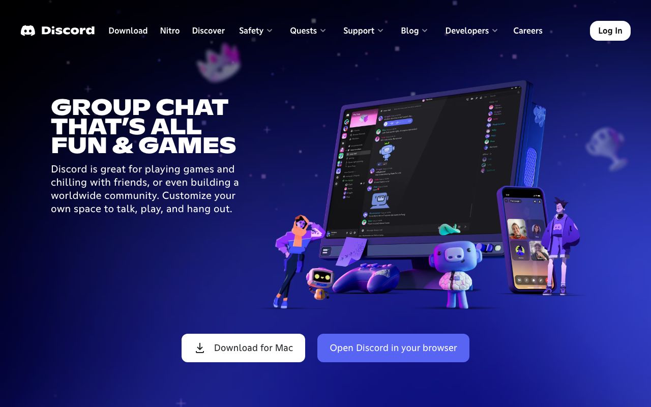
Website Preview
Colors
Primary
#5865F2
Brand primary, CTAs, mentions
#313338
Main chat background
#2B2D31
Sidebar background
#FFFFFF
Primary text
#949BA4
Timestamps, secondary text
Neutral
#1E1F22
Server icon bar
#2B2D31
Sidebar
#313338
Chat area
#949BA4
Icons, labels
#DBDEE1
Hovered icons
Semantic
#23A55A
Online presence dot
#F0B232
Away/idle presence
#F23F43
Do not disturb
#80848E
Offline presence
Typography
gg sans
Role
SizeWeightHeight
Display
32px8001.2
Heading
20px6001.3
Body
16px4001.375
Message
16px4001.375
Small
12px4001.3
DESIGN.md — Discord
Overview
Discord's design system (internally "Deco") creates a playful yet functional communication hub. Blurple — Discord's signature blue-purple — anchors the identity. The dark-first interface uses layered grays to create spatial depth across servers, channels, and chat panes.
Colors
Primary Palette
| Token | Hex | Usage |
|---|---|---|
color-blurple | #5865F2 | Brand primary, CTAs, mentions |
color-bg-primary | #313338 | Main chat background |
color-bg-secondary | #2B2D31 | Sidebar background |
color-text | #FFFFFF | Primary text |
color-text-muted | #949BA4 | Timestamps, secondary text |
Neutral Palette
| Token | Hex | Usage |
|---|---|---|
color-bg-tertiary | #1E1F22 | Server icon bar |
color-bg-secondary | #2B2D31 | Sidebar |
color-bg-primary | #313338 | Chat area |
color-interactive-normal | #949BA4 | Icons, labels |
color-interactive-hover | #DBDEE1 | Hovered icons |
Semantic Colors
| Token | Hex | Usage |
|---|---|---|
color-status-online | #23A55A | Online presence dot |
color-status-idle | #F0B232 | Away/idle presence |
color-status-dnd | #F23F43 | Do not disturb |
color-status-offline | #80848E | Offline presence |
Typography
| Role | Family | Size | Weight | Line Height |
|---|---|---|---|---|
| Display | gg sans | 32px | 800 | 1.2 |
| Heading | gg sans | 20px | 600 | 1.3 |
| Body | gg sans | 16px | 400 | 1.375 |
| Message | gg sans | 16px | 400 | 1.375 |
| Small | gg sans | 12px | 400 | 1.3 |
Spacing
| Token | Value | Usage |
|---|---|---|
space-1 | 4px | Reaction gaps |
space-2 | 8px | Message meta |
space-3 | 12px | Avatar to text |
space-4 | 16px | Message row |
space-6 | 24px | Section dividers |
Border Radius
| Token | Value | Usage |
|---|---|---|
radius-sm | 4px | Reaction bubbles, badges |
radius-md | 8px | Embeds, cards |
radius-lg | 16px | Modals |
radius-full | 9999px | Avatars |
Elevation
| Level | Value | Usage |
|---|---|---|
shadow-low | 0 1px 0 rgba(4,4,5,0.2) | Dividers |
shadow-high | 0 8px 16px rgba(0,0,0,0.24) | Tooltips, dropdowns |
shadow-modal | 0 16px 48px rgba(0,0,0,0.4) | Dialogs |
Components
Server Sidebar
- Vertical pill bar, 72px wide
- Circular server icons (48px), hover rounds to squircle
- Selection indicator: white pill on left edge
Message Row
- Avatar (40px) + username (colored by role) + timestamp
- Message content, attachment previews, embeds
- Reaction row with emoji + count bubbles
Voice Channel
- User list with avatar, name, mute/deafen icons
- Green ring on avatar when speaking
- Connect button in green
Do's and Don'ts
Do
- Use Blurple for interactive elements and brand moments
- Layer background shades to create spatial hierarchy
- Use role colors for usernames in chat
Don't
- Don't use pure black (#000) — always use the gray palette
- Don't make server icons smaller than 48px
- Don't suppress notification badges in active conversations