Figma
The collaborative interface design tool
13 colors
22 components
Inter
Mar 31, 2026
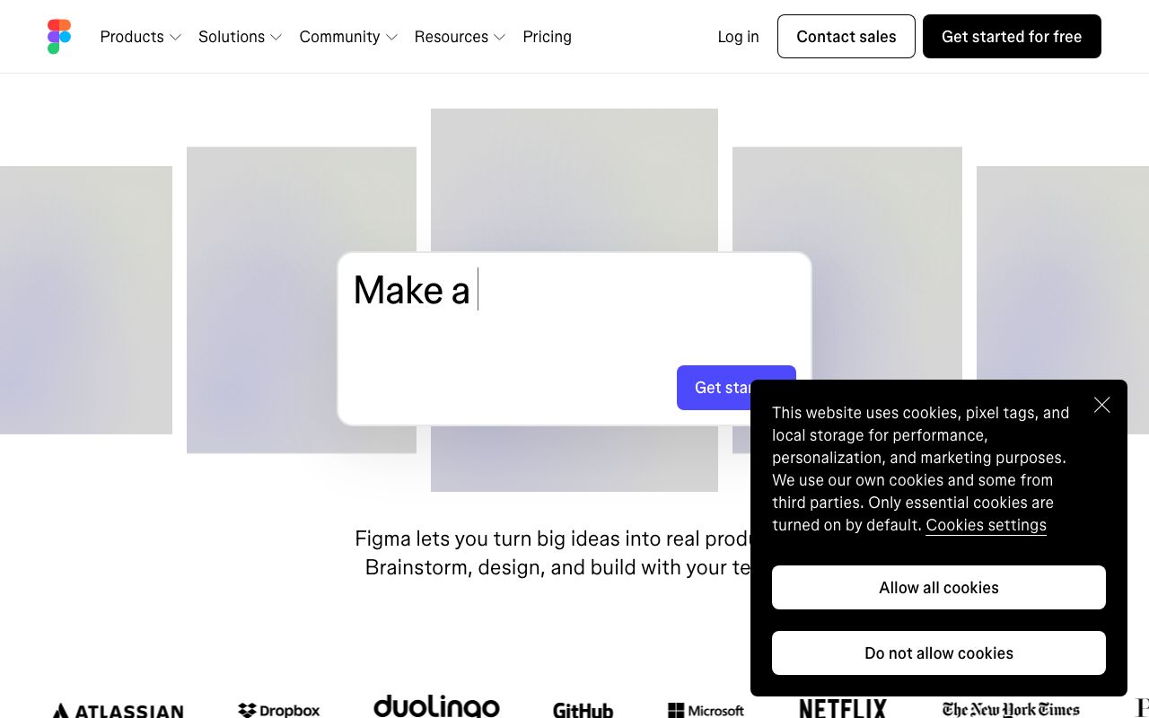
Website Preview
Colors
Primary
#0ACF83
Brand primary, Figma logo
#A259FF
Brand accent, FigJam
#F24E1E
Brand accent, notifications
#FF7262
Brand accent, highlights
#1ABCFE
Brand accent, links
Neutral
#2C2C2C
Editor canvas surround
#1E1E1E
Panel backgrounds
#3C3C3C
Panel borders
#999999
Muted labels
#F5F5F5
Default canvas background
Semantic
#1ABCFE
Selected layer outlines
#F24E1E
Broken links, errors
#A259FF
Component indicators
Typography
Inter
Role
SizeWeightHeight
Display
56px7001.1
Heading
32px6001.2
Body
16px4001.6
UI Label
11px5001.3
Panel Input
11px4001.3
DESIGN.md — Figma
Overview
Figma's design system reflects a multi-colored, expressive brand that celebrates collaboration and creativity. Rather than a single dominant brand hue, Figma uses a spectrum of bold colors — green, purple, red, coral, and blue — creating an energetic, playful identity. The interface itself remains restrained so the canvas stays neutral.
Colors
Primary Palette
| Token | Hex | Usage |
|---|---|---|
color-green | #0ACF83 | Brand primary, Figma logo |
color-purple | #A259FF | Brand accent, FigJam |
color-red | #F24E1E | Brand accent, notifications |
color-coral | #FF7262 | Brand accent, highlights |
color-blue | #1ABCFE | Brand accent, links |
Neutral Palette
| Token | Hex | Usage |
|---|---|---|
color-editor-bg | #2C2C2C | Editor canvas surround |
color-panel-bg | #1E1E1E | Panel backgrounds |
color-panel-border | #3C3C3C | Panel borders |
color-text-secondary | #999999 | Muted labels |
color-canvas | #F5F5F5 | Default canvas background |
Semantic Colors
| Token | Hex | Usage |
|---|---|---|
color-selection | #1ABCFE | Selected layer outlines |
color-error | #F24E1E | Broken links, errors |
color-component | #A259FF | Component indicators |
Typography
| Role | Family | Size | Weight | Line Height |
|---|---|---|---|---|
| Display | Inter | 56px | 700 | 1.1 |
| Heading | Inter | 32px | 600 | 1.2 |
| Body | Inter | 16px | 400 | 1.6 |
| UI Label | Inter | 11px | 500 | 1.3 |
| Panel Input | Inter | 11px | 400 | 1.3 |
Spacing
| Token | Value | Usage |
|---|---|---|
space-1 | 4px | Panel item gaps |
space-2 | 8px | Group padding |
space-3 | 12px | Section padding |
space-4 | 16px | Panel spacing |
space-8 | 32px | Marketing sections |
Border Radius
| Token | Value | Usage |
|---|---|---|
radius-sm | 2px | Panel inputs |
radius-md | 6px | Buttons, chips |
radius-lg | 8px | Modals, overlays |
radius-full | 9999px | Avatars, tags |
Elevation
| Level | Value | Usage |
|---|---|---|
shadow-sm | 0 1px 4px rgba(0,0,0,0.3) | Panels |
shadow-md | 0 4px 16px rgba(0,0,0,0.4) | Dropdowns |
shadow-lg | 0 12px 40px rgba(0,0,0,0.6) | Modals |
Components
Toolbar
- Top bar with tool icons (move, frame, pen, text)
- Active tool: filled icon + blue highlight
- Horizontal dividers between tool groups
Layer Panel
- Left sidebar, tree hierarchy
- Indent lines, expand/collapse triangles
- Lock and visibility toggles per layer
Inspector Panel
- Right sidebar showing selected element properties
- Design / Prototype / Inspect tabs
- Numeric inputs with scrub-to-adjust
Do's and Don'ts
Do
- Use the full brand color palette for marketing — never just one color
- Keep the editor chrome minimal and gray so the canvas stays focused
- Use Inter at 11px for UI labels inside the editor
Don't
- Don't use brand colors for UI controls inside the editor
- Don't use border radius larger than 8px in the app interface
- Don't place heavy visuals that compete with user content on the canvas