Framer
The web builder for creative professionals
13 colors
25 components
Inter
Mar 24, 2026
Website Preview
Colors
Primary
#0099FF
Primary blue
#000000
Canvas background
#FFFFFF
Primary text
#1A1A1A
Panel backgrounds
#555555
Secondary text
Neutral
#000000
Canvas background
#1A1A1A
Panel surfaces
#333333
Borders, dividers
#555555
Muted labels
#888888
Placeholder text
Semantic
#0099FF
Selection, active frames
#FF3B30
Error states, broken links
#FF9500
Overflow, clip warnings
Typography
Inter
Role
SizeWeightHeight
Display
64px7001.1
Heading
40px6001.2
Body
16px4001.6
UI
13px5001.4
Panel Label
11px5001.3
DESIGN.md — Framer
Overview
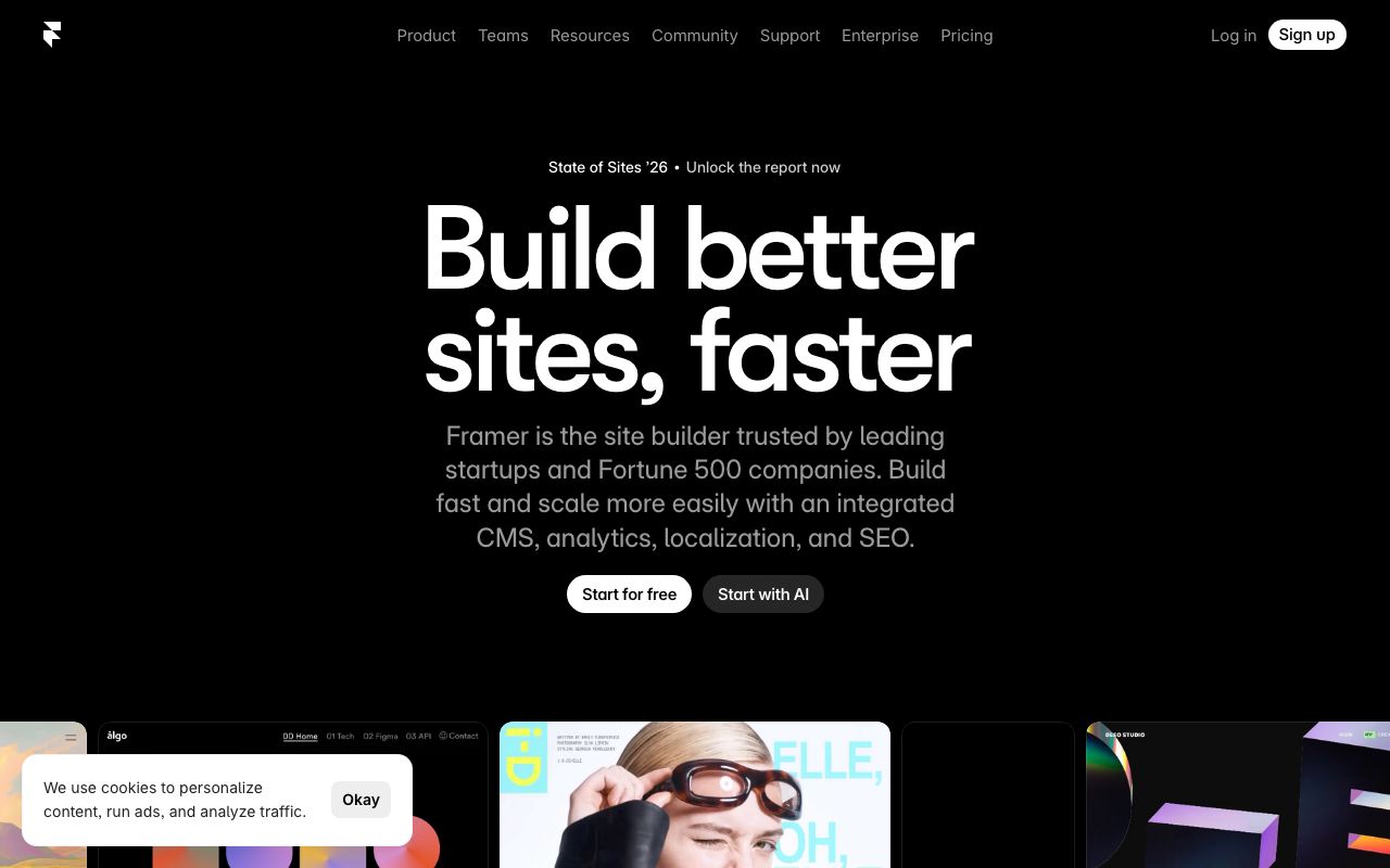
Framer's design system is a love letter to motion design. Clean black-and-white foundations with a vivid blue accent create a canvas that lets creative work shine. Every interaction is animated, communicating the product's core value of motion.
Colors
Primary Palette
| Token | Hex | Usage |
|---|---|---|
color-brand | #0099FF | Primary blue |
color-bg | #000000 | Canvas background |
color-text | #FFFFFF | Primary text |
color-surface | #1A1A1A | Panel backgrounds |
color-muted | #555555 | Secondary text |
Neutral Palette
| Token | Hex | Usage |
|---|---|---|
color-black | #000000 | Canvas background |
color-gray-900 | #1A1A1A | Panel surfaces |
color-gray-700 | #333333 | Borders, dividers |
color-gray-500 | #555555 | Muted labels |
color-gray-300 | #888888 | Placeholder text |
Semantic Colors
| Token | Hex | Usage |
|---|---|---|
color-success | #0099FF | Selection, active frames |
color-error | #FF3B30 | Error states, broken links |
color-warning | #FF9500 | Overflow, clip warnings |
Typography
| Role | Family | Size | Weight | Line Height |
|---|---|---|---|---|
| Display | Inter | 64px | 700 | 1.1 |
| Heading | Inter | 40px | 600 | 1.2 |
| Body | Inter | 16px | 400 | 1.6 |
| UI | Inter | 13px | 500 | 1.4 |
| Panel Label | Inter | 11px | 500 | 1.3 |
Spacing
| Token | Value | Usage |
|---|---|---|
space-1 | 4px | Panel item gaps |
space-2 | 8px | Input internal padding |
space-3 | 12px | Panel section padding |
space-4 | 16px | Panel group spacing |
space-8 | 32px | Marketing section gaps |
Border Radius
| Token | Value | Usage |
|---|---|---|
radius-sm | 4px | Panel inputs |
radius-md | 8px | Buttons, chips |
radius-lg | 12px | Cards, panels |
radius-full | 9999px | Avatars, badges |
Elevation
| Level | Value | Usage |
|---|---|---|
shadow-sm | 0 1px 4px rgba(0,0,0,0.4) | Panels |
shadow-md | 0 4px 16px rgba(0,0,0,0.5) | Dropdowns |
shadow-lg | 0 12px 40px rgba(0,0,0,0.7) | Modals |
Components
Canvas
- Infinite pan/zoom workspace
- Grid overlay with snap points
- Frame indicators with blue outlines
Property Panel
- Right sidebar, 280px width
- Collapsible sections: Layout, Style, Effects
- Numeric inputs with drag-to-adjust
Component Browser
- Left panel, searchable grid
- Drag-to-canvas interaction
- Hover preview with animation playback
Do's and Don'ts
Do
- Animate all state transitions (150-300ms)
- Use blue exclusively for selection and creation states
- Keep panel backgrounds distinct from canvas
Don't
- Don't use static transitions — everything should move
- Don't use shadows in the editor UI
- Don't use text larger than 13px in panels