GitHub
Where the world builds software
14 colors
26 components
Mona Sans, SF Mono, Consolas
Mar 30, 2026
Website Preview
Colors
Primary
#24292F
Primary text
#FFFFFF
Page background
#2DA44E
Merge, positive actions
#0969DA
Links, focus rings
#6E7781
Secondary text
Neutral
#F6F8FA
Page background
#D0D7DE
Borders, dividers
#E5E7EB
Subtle borders
#6E7781
Muted text
#FFFFFF
Text on colored bg
Semantic
#2DA44E
Open PRs, merged
#CF222E
Closed PRs, errors
#9A6700
Warnings, draft state
#8250DF
Merged pull requests
Typography
Mona Sans
Role
SizeWeightHeight
Display
40px7001.2
Heading
24px6001.3
Body
14px4001.5
Small
12px4001.4
SF Mono, Consolas
Role
SizeWeightHeight
Code
13px4001.6
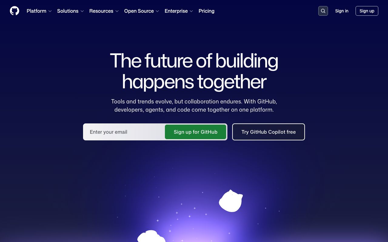
DESIGN.md — GitHub
Overview
GitHub's design system (Primer) is built for information-dense developer interfaces. The palette is anchored by a near-black ink with a signature green for positive actions and blue for links. Mona Sans replaced system fonts to give GitHub a distinctive modern voice while maintaining readability across millions of repositories.
Colors
Primary Palette
| Token | Hex | Usage |
|---|---|---|
color-fg-default | #24292F | Primary text |
color-canvas-default | #FFFFFF | Page background |
color-success | #2DA44E | Merge, positive actions |
color-accent | #0969DA | Links, focus rings |
color-fg-muted | #6E7781 | Secondary text |
Neutral Palette
| Token | Hex | Usage |
|---|---|---|
color-canvas-subtle | #F6F8FA | Page background |
color-border-default | #D0D7DE | Borders, dividers |
color-border-muted | #E5E7EB | Subtle borders |
color-fg-subtle | #6E7781 | Muted text |
color-fg-on-emphasis | #FFFFFF | Text on colored bg |
Semantic Colors
| Token | Hex | Usage |
|---|---|---|
color-success-fg | #2DA44E | Open PRs, merged |
color-danger-fg | #CF222E | Closed PRs, errors |
color-attention-fg | #9A6700 | Warnings, draft state |
color-done-fg | #8250DF | Merged pull requests |
Typography
| Role | Family | Size | Weight | Line Height |
|---|---|---|---|---|
| Display | Mona Sans | 40px | 700 | 1.2 |
| Heading | Mona Sans | 24px | 600 | 1.3 |
| Body | Mona Sans | 14px | 400 | 1.5 |
| Small | Mona Sans | 12px | 400 | 1.4 |
| Code | SF Mono, Consolas | 13px | 400 | 1.6 |
Spacing
| Token | Value | Usage |
|---|---|---|
space-1 | 4px | Inline gaps |
space-2 | 8px | Row padding |
space-3 | 12px | Compact sections |
space-4 | 16px | Card padding |
space-6 | 24px | Section gaps |
Border Radius
| Token | Value | Usage |
|---|---|---|
radius-sm | 3px | Labels, tags |
radius-md | 6px | Cards, modals |
radius-lg | 8px | Dialogs |
radius-full | 9999px | Avatars |
Elevation
| Level | Value | Usage |
|---|---|---|
shadow-resting | 0 1px 0 rgba(31,35,40,0.04) | Cards, buttons |
shadow-floating | 0 8px 24px rgba(140,149,159,0.2) | Dropdowns, tooltips |
shadow-overlay | 0 16px 32px rgba(140,149,159,0.15) | Modals |
Components
Repository Card
- Repo name as link in blue, description below
- Language dot + name, star count, fork count
- 1px border, 6px radius
Pull Request Badge
- Open: green icon + text, Merged: purple, Closed: red
- Condensed metadata row: author, reviewers, labels
Action Bar
- Horizontal tab bar: Code, Issues, Pull Requests, Actions...
- Active tab: bottom border 2px in
#FD8C73 - Counter badges next to tab labels
Do's and Don'ts
Do
- Use green exclusively for success/merge states
- Keep information density high — GitHub users expect it
- Use Primer components for consistency across features
Don't
- Don't use rounded corners beyond 6px for containers
- Don't hide metadata that developers rely on (commit SHA, timestamps)
- Don't use color alone to convey status — always pair with icons