Hashnode
Blogging platform for developers
12 colors
17 components
Inter, Fira Code
Apr 8, 2026
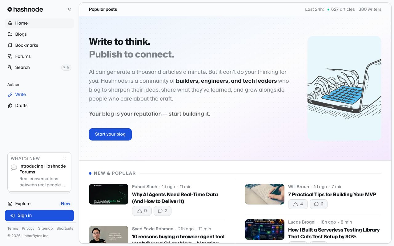
Website Preview
Colors
Primary
#2962FF
CTAs, links, active states
#1A4FDB
Button hover
#6C47FF
Tags, series labels
Neutral
#1C1C1C
Headings and body
#6C6C6C
Meta, dates, captions
#9CA3AF
Placeholders
#FFFFFF
Page background
#F5F5F5
Code blocks, sidebars
#E5E7EB
Dividers, card borders
Semantic
#059669
Saved, published
#DC2626
Errors
#D97706
Draft status
Typography
Inter
Role
SizeWeightHeight
Display
44px8001.1
H1
36px7001.2
H2
26px7001.3
H3
20px6001.4
Body
18px4001.8
Caption
14px4001.5
Fira Code
Role
SizeWeightHeight
Code
15px4001.6
Design System Inspired by Hashnode
1. Visual Theme & Atmosphere
Hashnode is a writing-first developer blogging platform. A vivid cobalt blue accent on a clean white reading surface creates an energetic but editorial feel. The design prioritises long-form readability and content discovery.
Key Characteristics:
- Cobalt blue on white — high contrast, editorial
- 18px body text for comfortable long reads
- Generous line height, tight UI chrome
- Community-forward with avatars and social signals
2. Color Palette & Roles
Primary
- Brand Blue (
#2962FF): CTAs, links, active states - Blue Hover (
#1A4FDB): Button hover
Accent Colors
- Purple (
#6C47FF): Tags, series labels
Neutral Scale
- Text Primary (
#1C1C1C): Headings and body - Text Secondary (
#6C6C6C): Meta, dates, captions - Text Muted (
#9CA3AF): Placeholders
Surface & Borders
- Background (
#FFFFFF): Page background - Surface (
#F5F5F5): Code blocks, sidebars - Border (
#E5E7EB): Dividers, card borders
Semantic / Status
- Success (
#059669): Saved, published - Error (
#DC2626): Errors - Warning (
#D97706): Draft status
3. Typography Rules
Font Family
Primary: Inter, fallback: system-ui, sans-serif. Code: Fira Code
Hierarchy
| Role | Font | Size | Weight | Line Height | Letter Spacing | Notes |
|---|---|---|---|---|---|---|
| Display | Inter | 44px | 800 | 1.1 | -0.02em | Blog title |
| H1 | Inter | 36px | 700 | 1.2 | -0.01em | Post title |
| H2 | Inter | 26px | 700 | 1.3 | 0 | Section heading |
| H3 | Inter | 20px | 600 | 1.4 | 0 | Sub-section |
| Body | Inter | 18px | 400 | 1.8 | 0 | Article prose |
| Caption | Inter | 14px | 400 | 1.5 | 0 | Meta, tags |
| Code | Fira Code | 15px | 400 | 1.6 | 0 | Code blocks |
Principles
- 18px body with 1.8 line height optimises for long-form reading
- Never reduce article column width below 680px
4. Component Stylings
Buttons
- Primary: bg
#2962FF, text#FFFFFF, padding10px 20px, radius6px, font 15px/600 - Secondary: bg
#FFFFFF, border1px solid #E5E7EB, text#1C1C1C - Ghost: bg
transparent, text#2962FF, no border
Cards & Containers
- bg
#FFFFFF, border1px solid #E5E7EB, radius8px, padding20px - Hover: box-shadow
0 2px 8px rgba(0,0,0,0.08)
Inputs & Forms
- Border
1px solid #E5E7EB, radius6px, padding10px 14px, font 16px - Focus: border
#2962FF
Navigation
- Top nav
#FFFFFF, height 56px, border-bottom#E5E7EB - Left sidebar 260px for blog dashboard
5. Layout Principles
Spacing System
- 4px — Inline gaps
- 8px — Tag spacing, tight pairs
- 16px — Card padding
- 24px — Section separation
- 32px — Article section breaks
- 48px — Page sections
- 64px — Hero spacing
Grid & Container
- Article max width 720px. Feed max width 1100px, 3-column card grid
Whitespace Philosophy
Content is the product — UI chrome must recede completely.
Border Radius Scale
- None (0px): Full-width banners
- Sm (4px): Tags, badges
- Md (6px): Buttons, inputs
- Lg (8px): Cards
- Full (9999px): Avatars, topic pills
6. Depth & Elevation
| Level | Treatment | Use |
|---|---|---|
| Flat | none | Article surface |
| Raised | 0 1px 3px rgba(0,0,0,0.08) | Feed cards |
| Overlay | 0 4px 12px rgba(0,0,0,0.12) | Dropdowns |
| Modal | 0 8px 32px rgba(0,0,0,0.16) | Dialogs |
7. Do's and Don'ts
Do
- Use 18px body text — never 16px for article prose
- Keep blue for interactive elements only
- Show author avatar prominently on every post card
Don't
- Don't truncate article titles in card views
- Don't add sidebar content that competes with the article
- Don't use blue for non-interactive decorative elements
8. Responsive Behavior
Breakpoints
| Name | Width | Key Changes |
|---|---|---|
| Mobile | 0–767px | Single column feed, hidden sidebar |
| Tablet | 768–1023px | 2-column feed |
| Desktop | 1024px+ | 3-column feed + sidebar |
Touch Targets
Minimum 44×44px. Like and bookmark buttons are 40px with 4px padding.
Collapsing Strategy
Sidebar hides on mobile. Feed switches to single column. Article stays 720px max.
9. Agent Prompt Guide
Quick Color Reference
- Primary CTA: Brand Blue (
#2962FF) - Background: White (
#FFFFFF) - Body text: Near-black (
#1C1C1C) - Secondary text: Gray (
#6C6C6C) - Border: Light Gray (
#E5E7EB) - Success: Green (
#059669)
Iteration Guide
- Body text is 18px — larger than typical SaaS, optimised for reading
- Blue is used only for links and CTAs — never for decoration
- Article column is max 720px — enforce this in all layouts
- Code blocks use Fira Code at 15px with light gray background
- Card hover reveals shadow, not border color change