Hugging Face
The AI community building the future
Brand highlight, hero accents
CTAs, links, active states
External links, dataset indicators
Headings, body
Metadata, captions
Placeholders
Page background
Cards, sidebar
Highlighted model cards
Dividers, card borders
Download success, passing tests
Errors, broken models
Deprecated models
New model indicators
Design System Inspired by Hugging Face
1. Visual Theme & Atmosphere
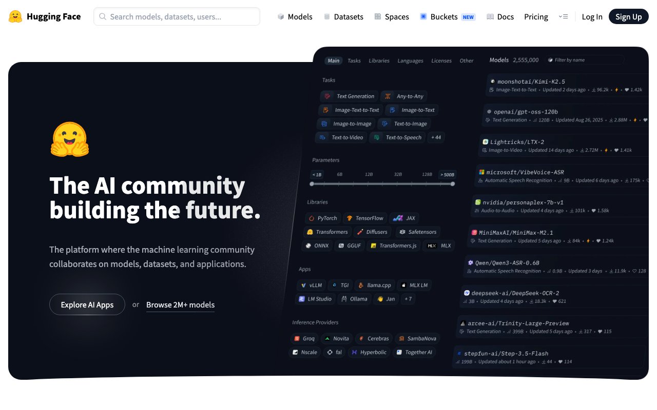
Hugging Face is the GitHub of AI — a warm, community-first ML platform built around model cards, datasets, and collaborative research. The emoji mascot and yellow-orange palette give it a distinctly friendly personality that sets it apart from corporate AI. The design scales from simple model cards to complex code notebooks.
Key Characteristics:
- Yellow-orange on white — warm and welcoming
- Community-first: stars, likes, downloads front and center
- Source Sans for approachable readability
- Open-source personality in every design decision
2. Color Palette & Roles
Primary
- Brand Yellow (
#FFD21E): Brand highlight, hero accents - Orange (
#FF9D00): CTAs, links, active states
Accent Colors
- Blue (
#3B82F6): External links, dataset indicators
Neutral Scale
- Text Primary (
#1C1C1C): Headings, body - Text Secondary (
#6B7280): Metadata, captions - Text Muted (
#9CA3AF): Placeholders
Surface & Borders
- Background (
#FFFFFF): Page background - Surface (
#F9FAFB): Cards, sidebar - Surface Warm (
#FFF9E6): Highlighted model cards - Border (
#E5E7EB): Dividers, card borders
Semantic / Status
- Success (
#10B981): Download success, passing tests - Error (
#EF4444): Errors, broken models - Warning (
#F59E0B): Deprecated models - New (
#FFD21E): New model indicators
3. Typography Rules
Font Family
Primary: Source Sans 3, fallback: system-ui, sans-serif. Code: Source Code Pro
Hierarchy
| Role | Font | Size | Weight | Line Height | Letter Spacing | Notes |
|---|---|---|---|---|---|---|
| H1 | Source Sans | 36px | 700 | 1.2 | -0.01em | Page titles |
| H2 | Source Sans | 26px | 600 | 1.3 | 0 | Section headings |
| H3 | Source Sans | 20px | 600 | 1.4 | 0 | Card headings |
| Body | Source Sans | 16px | 400 | 1.6 | 0 | Model card prose |
| Small | Source Sans | 14px | 400 | 1.5 | 0 | Metadata, tags |
| Code | Source Code Pro | 14px | 400 | 1.6 | 0 | Code samples |
Principles
- Source Sans has warmth that matches the community-first brand
- Model card readability is paramount — 16px with 1.6 line-height
4. Component Stylings
Buttons
- Primary: bg
#FF9D00, text#FFFFFF, padding9px 18px, radius8px, font 15px/600 - Secondary: bg
#FFFFFF, border1px solid #E5E7EB, text#1C1C1C - Like: heart icon + count, bg
#FFF9E6, border1px solid #FFD21E
Cards & Containers
- bg
#FFFFFF, border1px solid #E5E7EB, radius10px, padding16px - Hover: border
#FF9D00, box-shadow0 2px 8px rgba(255,157,0,0.1)
Inputs & Forms
- Border
1px solid #E5E7EB, radius8px, padding9px 14px - Focus: border
#FF9D00
Navigation
- Top nav
#FFFFFF, height 56px, border-bottom#E5E7EB - Left sidebar on model pages, 220px
5. Layout Principles
Spacing System
- 4px — Tag gaps
- 8px — Stat icon-label gaps
- 12px — Card inner spacing
- 16px — Card padding
- 24px — Section gaps
- 32px — Model grid gaps
- 48px — Page sections
Grid & Container
- Max width 1200px. Model grid: 3-column, 16px gutters.
Whitespace Philosophy
Community content needs space to breathe — cards are not dense.
Border Radius Scale
- None (0px): Code block edges
- Sm (4px): Task type badges, tags
- Md (8px): Buttons, inputs
- Lg (10px): Model cards
- Full (9999px): Avatars, like button
6. Depth & Elevation
| Level | Treatment | Use |
|---|---|---|
| Flat | none | Page background |
| Raised | 0 1px 3px rgba(0,0,0,0.08) | Model cards |
| Overlay | 0 4px 12px rgba(0,0,0,0.12) | Dropdowns |
| Modal | 0 8px 32px rgba(0,0,0,0.15) | Dialogs |
7. Do's and Don'ts
Do
- Use the emoji mascot for personality in empty states and onboarding
- Show download count, likes, and last-updated prominently on every card
- Use yellow for brand moments and highlights; orange for interactive
Don't
- Don't remove the yellow — it's the most recognisable element of the brand
- Don't use dark backgrounds for main content
- Don't hide community stats — they're core to trust
8. Responsive Behavior
Breakpoints
| Name | Width | Key Changes |
|---|---|---|
| Mobile | 0–767px | Single column model list |
| Tablet | 768–1023px | 2-column grid |
| Desktop | 1024px+ | 3-column grid + sidebar |
Touch Targets
Minimum 44×44px. Like and download buttons are 44px.
Collapsing Strategy
Sidebar hides on mobile. Grid goes single column. Model card stats remain visible.
9. Agent Prompt Guide
Quick Color Reference
- Brand: Yellow (
#FFD21E) - CTA/Interactive: Orange (
#FF9D00) - Background: White (
#FFFFFF) - Text:
#1C1C1C - Border:
#E5E7EB - Card hover border: Orange (
#FF9D00)
Iteration Guide
- Orange is the interactive color; yellow is the brand accent — never swap
- Model cards always show: name, task type, downloads, likes, updated date
- Community stats are never hidden — they build trust
- Source Sans (not Inter) is the brand typeface
- Card border-radius is 10px — rounder than most developer tools