Lemon Squeezy
Payments, tax & subscriptions for software companies
13 colors
18 components
Inter
Mar 28, 2026
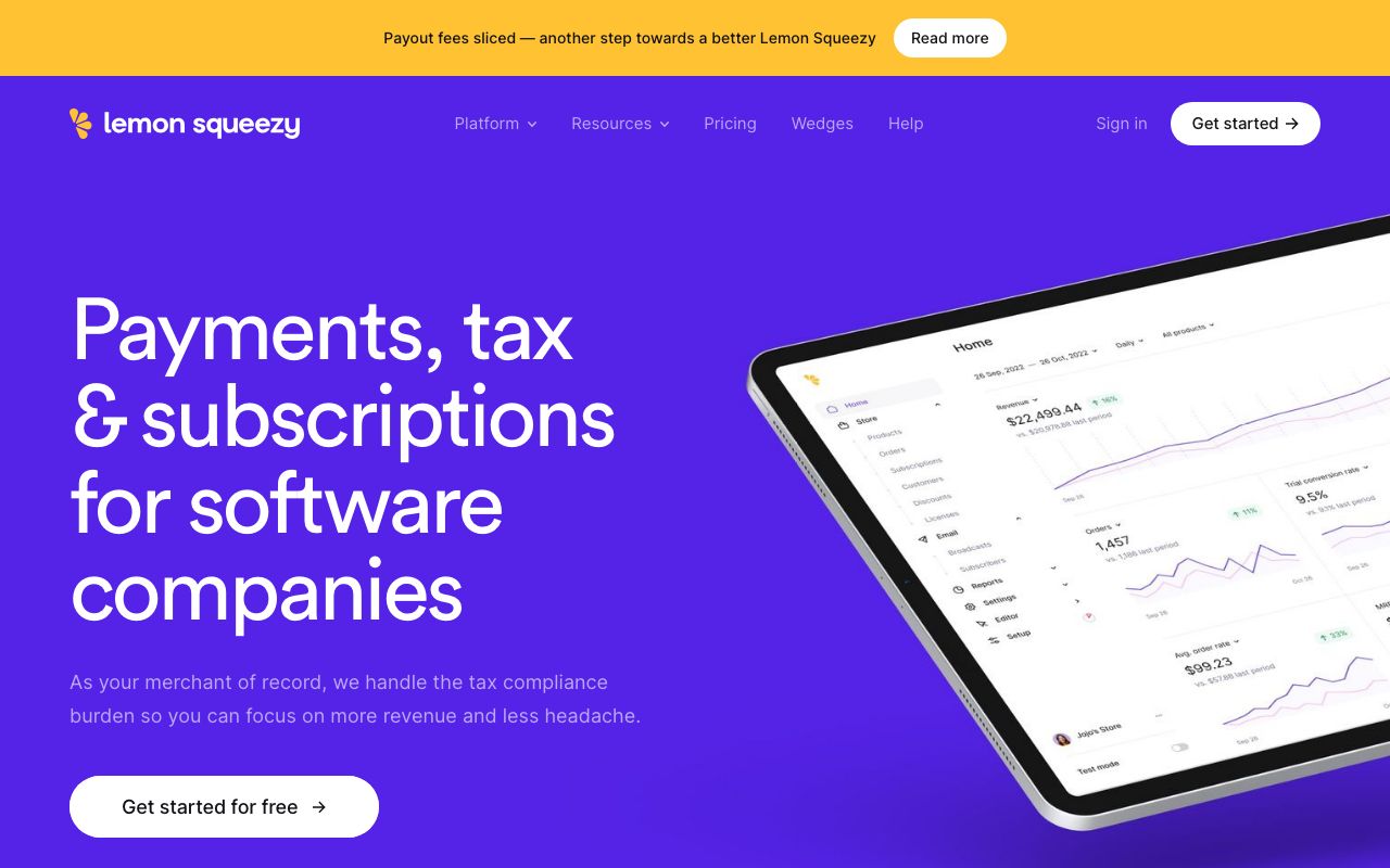
Website Preview
Colors
Primary
#FFC233
Lemon yellow
#1E1E2E
Dark background
#7C3AED
Purple accent
#FFFFFF
Primary text
#2D2D3F
Card surfaces
Neutral
#1E1E2E
Background
#2D2D3F
Card surface
#3D3D50
Borders
#6B6B80
Muted text
#FFFFFF
Primary text
Semantic
#22C55E
Successful payment, active license
#EF4444
Failed payment, expired
#F97316
Expiring soon, pending
Typography
Inter
Role
SizeWeightHeight
Display
48px8001.1
Heading
32px7001.2
Body
16px4001.6
Label
14px5001.4
DESIGN.md — Lemon Squeezy
Overview
Lemon Squeezy brings playfulness to payments. A warm yellow brand color paired with deep purple accents creates an energetic, approachable identity that stands apart from typical fintech austerity. Rounded shapes and generous spacing reinforce the friendly tone.
Colors
Primary Palette
| Token | Hex | Usage |
|---|---|---|
color-brand | #FFC233 | Lemon yellow |
color-bg | #1E1E2E | Dark background |
color-accent | #7C3AED | Purple accent |
color-text | #FFFFFF | Primary text |
color-surface | #2D2D3F | Card surfaces |
Neutral Palette
| Token | Hex | Usage |
|---|---|---|
color-dark-950 | #1E1E2E | Background |
color-dark-800 | #2D2D3F | Card surface |
color-dark-700 | #3D3D50 | Borders |
color-dark-500 | #6B6B80 | Muted text |
color-white | #FFFFFF | Primary text |
Semantic Colors
| Token | Hex | Usage |
|---|---|---|
color-success | #22C55E | Successful payment, active license |
color-error | #EF4444 | Failed payment, expired |
color-warning | #F97316 | Expiring soon, pending |
Typography
| Role | Family | Size | Weight | Line Height |
|---|---|---|---|---|
| Display | Inter | 48px | 800 | 1.1 |
| Heading | Inter | 32px | 700 | 1.2 |
| Body | Inter | 16px | 400 | 1.6 |
| Label | Inter | 14px | 500 | 1.4 |
Spacing
| Token | Value | Usage |
|---|---|---|
space-1 | 4px | Icon gaps |
space-2 | 8px | Field gaps |
space-4 | 16px | Card padding |
space-6 | 24px | Section gaps |
space-8 | 32px | Page sections |
Border Radius
| Token | Value | Usage |
|---|---|---|
radius-sm | 6px | Badges |
radius-md | 12px | Buttons, inputs |
radius-lg | 16px | Cards |
radius-xl | 24px | Checkout overlay |
Elevation
| Level | Value | Usage |
|---|---|---|
shadow-sm | 0 1px 4px rgba(0,0,0,0.3) | Cards |
shadow-md | 0 4px 16px rgba(124,58,237,0.2) | Hovered product cards |
shadow-lg | 0 12px 40px rgba(0,0,0,0.5) | Checkout overlay |
Components
Product Card
- Thumbnail image, name, price
- Buy button in yellow
- Variant selector (size, license)
Checkout Overlay
- Slide-in from right
- Product summary, quantity
- Payment form with card/PayPal
- SSL security badge
Revenue Dashboard
- Big number cards (MRR, customers, churn)
- Revenue trend line chart
- Recent orders table
Do's and Don'ts
Do
- Use yellow for purchase/positive actions
- Use purple for navigation and secondary elements
- Round corners generously (12px+ for cards)
Don't
- Don't use yellow for warning states — use orange
- Don't mix the dark theme with light surfaces
- Don't make checkout more than 2 steps