Mistral AI
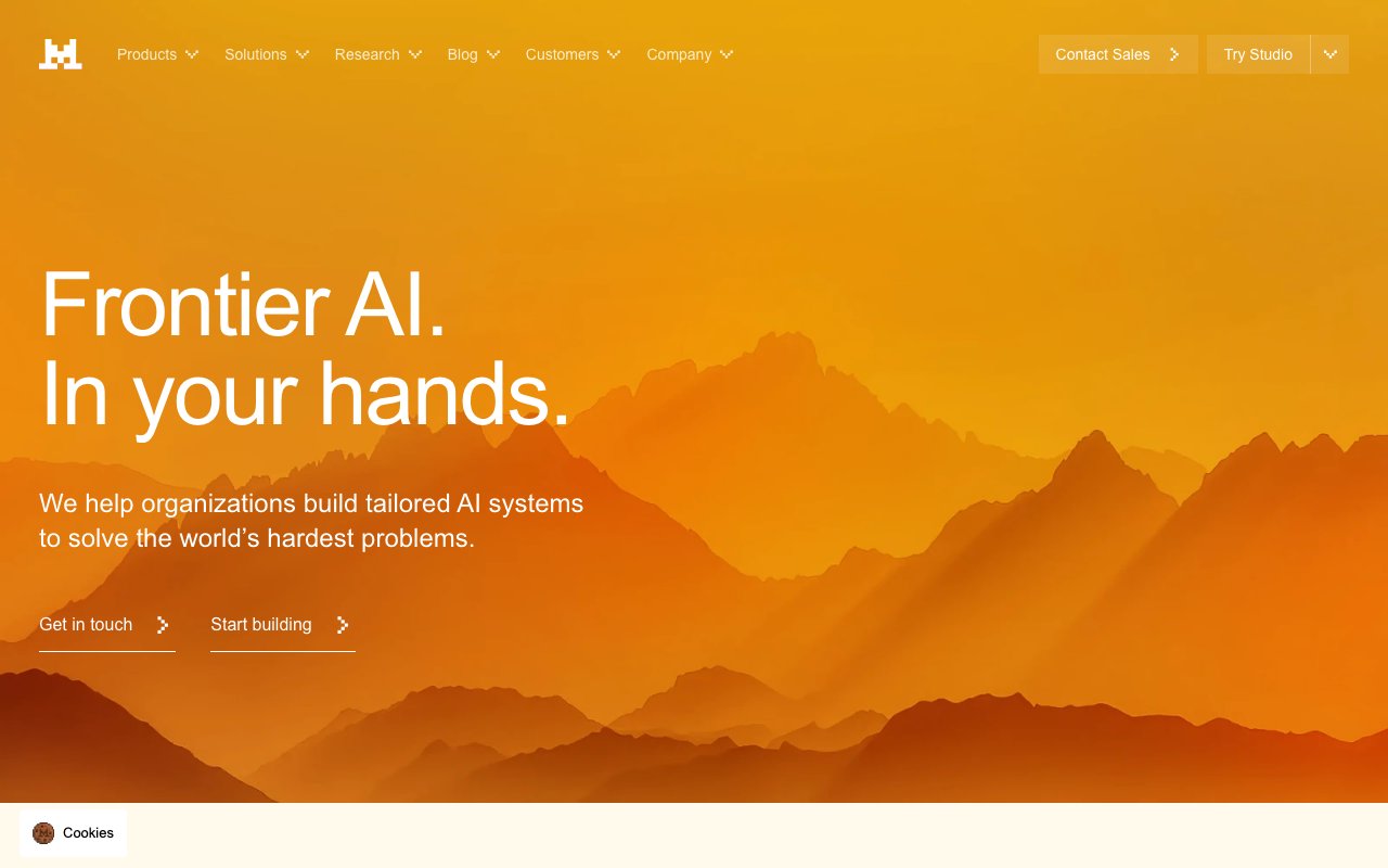
Frontier AI in your hands
CTAs, active states, brand accent
Hover state
Hover highlights, secondary elements
Headings, body
Captions, metadata
Placeholders
App background
Cards, panels
Input fields
Dividers
Completed generations
API errors
Rate limit warnings
Informational notices
Design System Inspired by Mistral AI
1. Visual Theme & Atmosphere
Mistral AI is bold and direct — a French AI company that positions itself as the efficient, open alternative. Vivid orange on near-black creates a confident, high-energy identity. The design reflects the brand personality: no-nonsense, technically serious, European precision.
Key Characteristics:
- Orange on near-black — bold and unmistakable
- High-contrast, zero decoration
- Inter at large weights for confident headlines
- Dark-first — the product and marketing share one palette
2. Color Palette & Roles
Primary
- Orange (
#FF7000): CTAs, active states, brand accent - Orange Dark (
#D45D00): Hover state
Accent Colors
- Orange Light (
#FF9440): Hover highlights, secondary elements
Neutral Scale
- Text Primary (
#F2F2F2): Headings, body - Text Secondary (
#8A8A8A): Captions, metadata - Text Muted (
#5A5A5A): Placeholders
Surface & Borders
- Background (
#0D0D0D): App background - Surface (
#1A1A1A): Cards, panels - Surface Raised (
#242424): Input fields - Border (
#2E2E2E): Dividers
Semantic / Status
- Success (
#22C55E): Completed generations - Error (
#EF4444): API errors - Warning (
#F59E0B): Rate limit warnings - Info (
#60A5FA): Informational notices
3. Typography Rules
Font Family
Primary: Inter, fallback: system-ui, sans-serif. Code: JetBrains Mono
Hierarchy
| Role | Font | Size | Weight | Line Height | Letter Spacing | Notes |
|---|---|---|---|---|---|---|
| Display | Inter | 60px | 800 | 1.05 | -0.03em | Hero headlines |
| H1 | Inter | 44px | 700 | 1.1 | -0.02em | Page titles |
| H2 | Inter | 32px | 700 | 1.2 | -0.01em | Section headings |
| H3 | Inter | 22px | 600 | 1.3 | 0 | Sub-sections |
| Body | Inter | 17px | 400 | 1.65 | 0 | Marketing prose |
| Caption | Inter | 14px | 400 | 1.5 | 0 | Labels, meta |
| Code | JetBrains Mono | 14px | 400 | 1.6 | 0 | Model code |
Principles
- Extra-bold (800) display weight communicates confidence
- Never use light or thin weights — Mistral is not delicate
4. Component Stylings
Buttons
- Primary: bg
#FF7000, text#FFFFFF, padding12px 24px, radius6px, font 16px/700 - Secondary: bg
transparent, border1px solid #2E2E2E, text#F2F2F2 - Ghost: bg
transparent, text#8A8A8A, hover text#F2F2F2
Cards & Containers
- bg
#1A1A1A, border1px solid #2E2E2E, radius8px, padding24px - Model cards: license badge top-right, parameter count prominent
Inputs & Forms
- bg
#242424, border1px solid #2E2E2E, radius6px, padding12px 16px, text#F2F2F2 - Focus: border
#FF7000
Navigation
- Top nav
#0D0D0D, height 64px, border-bottom#1A1A1A
5. Layout Principles
Spacing System
- 8px — Tight element gaps
- 16px — Card padding
- 24px — Section inner spacing
- 32px — Component blocks
- 48px — Section gaps
- 64px — Major page sections
- 96px — Hero sections
Grid & Container
- Max width 1200px. 12-column grid, 24px gutters.
Whitespace Philosophy
Bold typography + dark bg = let whitespace breathe. Don't compress.
Border Radius Scale
- None (0px): Dividers, full-width elements
- Sm (4px): License badges, version chips
- Md (6px): Buttons, inputs
- Lg (8px): Cards
- Full (9999px): Avatars
6. Depth & Elevation
| Level | Treatment | Use |
|---|---|---|
| Flat | none | Background |
| Raised | 0 1px 4px rgba(0,0,0,0.4) | Cards |
| Overlay | 0 4px 20px rgba(0,0,0,0.6) | Dropdowns |
| Modal | 0 8px 40px rgba(0,0,0,0.7) | Dialogs |
7. Do's and Don'ts
Do
- Use orange boldly for CTAs and brand accent moments
- Keep headlines at 700–800 weight — bold is the brand
- Show model parameter counts and license type prominently
Don't
- Don't soften the design with gradients or pastels
- Don't use orange for warning states — use amber
- Don't use light backgrounds anywhere
8. Responsive Behavior
Breakpoints
| Name | Width | Key Changes |
|---|---|---|
| Mobile | 0–767px | Single column, stacked cards |
| Tablet | 768–1023px | 2-column grid |
| Desktop | 1024px+ | Full layout |
Touch Targets
Minimum 44×44px. CTA buttons are 48px tall.
Collapsing Strategy
Nav collapses to hamburger. Model grid goes single column.
9. Agent Prompt Guide
Quick Color Reference
- CTA: Orange (
#FF7000) - Background: Near-black (
#0D0D0D) - Surface: Dark (
#1A1A1A) - Text:
#F2F2F2 - Border:
#2E2E2E - Success: Green (
#22C55E)
Iteration Guide
- Display headlines are 800 weight — this is deliberate, not a mistake
- Orange is always solid — no opacity or gradient treatments
- Never use a light color scheme
- Apache 2.0 badge = green, commercial = blue — keep license indicators consistent
- Code blocks are
#242424on#1A1A1Abg — slight contrast