Netflix
Watch anywhere. Cancel anytime.
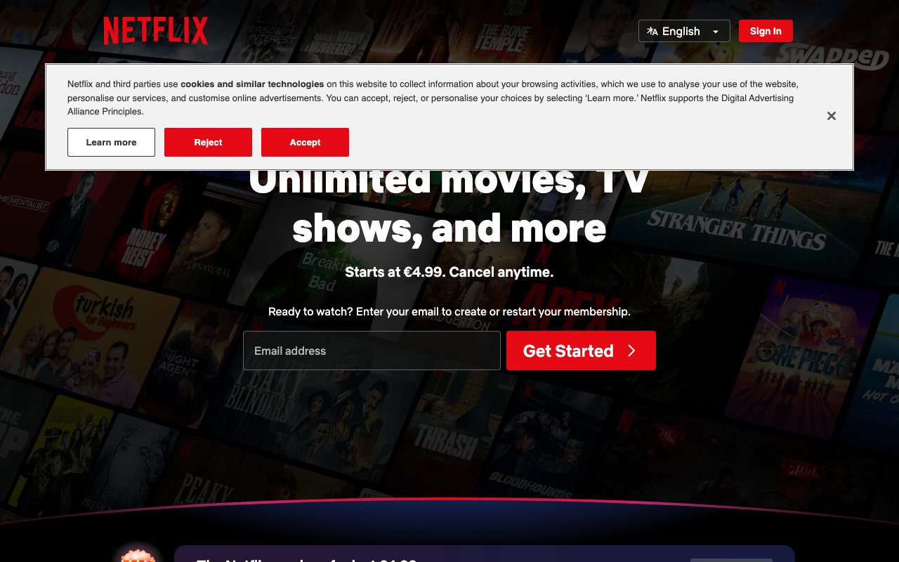
Logo, primary CTA (Play, Sign Up)
Hover states, pressed buttons
Secondary red moments, continue watching bar
All titles, body text
Metadata, episode descriptions
UI labels, inactive nav
App background
Cards on hover, tooltips
Expanded cards, modals
% match indicator
New content badge
Top 10 badge (uses brand red)
Design System Inspired by Netflix
1. Visual Theme & Atmosphere
Netflix's design is one of the most iconic streaming interfaces in the world. The signature red on black is instantly recognisable. The UI is designed to disappear behind content — dark surfaces keep the focus on thumbnails and playback. Netflix Sans maximises screen real estate on TVs, phones, and browsers.
Key Characteristics:
- Netflix red on true black — cinematic and bold
- Content is the UI — thumbnails, trailers, artwork
- UI must recede: no competing visual elements
- Netflix Sans custom typeface for streaming interface readability
2. Color Palette & Roles
Primary
- Netflix Red (
#E50914): Logo, primary CTA (Play, Sign Up) - Red Dark (
#831010): Hover states, pressed buttons
Accent Colors
- Red Muted (
#B20710): Secondary red moments, continue watching bar
Neutral Scale
- Text Primary (
#FFFFFF): All titles, body text - Text Secondary (
#BCBCBC): Metadata, episode descriptions - Text Muted (
#808080): UI labels, inactive nav
Surface & Borders
- Background (
#141414): App background - Surface (
#1F1F1F): Cards on hover, tooltips - Surface Elevated (
#2D2D2D): Expanded cards, modals - Gradient (
linear-gradient(to top, #141414, transparent)): Content fade
Semantic / Status
- Match Score (
#46D369): % match indicator - New (
#54B9C5): New content badge - Top 10 (
#E50914): Top 10 badge (uses brand red)
3. Typography Rules
Font Family
Primary: Netflix Sans, fallback: Arial, Helvetica, sans-serif
Hierarchy
| Role | Font | Size | Weight | Line Height | Letter Spacing | Notes |
|---|---|---|---|---|---|---|
| Hero | Netflix Sans | 52px | 700 | 1.1 | -0.01em | Title card overlays |
| H1 | Netflix Sans | 36px | 700 | 1.2 | 0 | Section headings |
| H2 | Netflix Sans | 24px | 600 | 1.3 | 0 | Row titles |
| H3 | Netflix Sans | 18px | 600 | 1.4 | 0 | Card titles on hover |
| Body | Netflix Sans | 16px | 400 | 1.5 | 0 | Episode descriptions |
| UI | Netflix Sans | 14px | 500 | 1.3 | 0.02em | Buttons, nav, labels |
| Small | Netflix Sans | 12px | 400 | 1.4 | 0 | Duration, ratings |
Principles
- Netflix Sans is optimised for TV displays — wider letterforms at small sizes
- Never use thin or light weights on dark backgrounds
4. Component Stylings
Buttons
- Play: bg
#FFFFFF, text#141414, padding12px 24px, radius4px, font 16px/700, play icon left - More Info: bg
rgba(109,109,110,0.7), text#FFFFFF, same padding/radius - CTA (marketing): bg
#E50914, text#FFFFFF, padding16px 32px, radius4px
Cards & Containers
- Default: no border, no bg — just thumbnail image
- Hover: scale
1.05, z-index elevated, info panel expands below - Expanded card: bg
#1F1F1F, radius6px, shadow0 8px 24px rgba(0,0,0,0.7)
Inputs & Forms
- Email input: bg
#333333, border1px solid #8C8C8C, radius4px, font 16px - Focus: border
#FFFFFF
Navigation
- Top nav
linear-gradient(#141414, transparent)fades to transparent - On scroll: solid
#141414 - Logo left, nav links right, profile/search icons far right
5. Layout Principles
Spacing System
- 8px — Card hover gap
- 16px — Row padding
- 20px — Card info padding
- 24px — Row-to-row gaps
- 32px — Section breaks
- 48px — Hero/banner spacing
- 64px — Major sections
Grid & Container
- Content rows: horizontal scroll, 3–6 cards visible depending on screen.
- Each row is an independent horizontal strip with a category title.
Whitespace Philosophy
No whitespace — the grid should be dense with content. Dark fills the gaps.
Border Radius Scale
- None (0px): Hero full-bleed images
- Sm (4px): Buttons, progress bars, UI badges
- Md (6px): Expanded card containers
- Full (9999px): Avatar, profile circle
6. Depth & Elevation
| Level | Treatment | Use |
|---|---|---|
| Flat | none | Default thumbnail grid |
| Hover card | 0 6px 24px rgba(0,0,0,0.7) | Expanded card on hover |
| Modal | 0 12px 48px rgba(0,0,0,0.8) | Detail modal |
7. Do's and Don'ts
Do
- Use dark backgrounds throughout — the UI disappears behind content
- Reserve red for Netflix brand elements and sign-up CTAs only
- Scale cards on hover with a smooth transform — it's a core interaction
Don't
- Don't use white backgrounds anywhere in the streaming interface
- Don't reduce thumbnail size — artwork is the product
- Don't show text over thumbnails without a gradient overlay
8. Responsive Behavior
Breakpoints
| Name | Width | Key Changes |
|---|---|---|
| Mobile | 0–499px | 2 cards per row, stacked nav |
| Tablet | 500–1099px | 3–4 cards per row |
| Desktop | 1100px+ | 5–6 cards per row |
| TV | 1800px+ | 6–8 cards per row |
Touch Targets
Minimum 44×44px. Play button on mobile is full card-width.
Collapsing Strategy
Card hover interactions become tap-to-expand on mobile. Row scroll becomes swipe.
9. Agent Prompt Guide
Quick Color Reference
- Brand/CTA: Netflix Red (
#E50914) - Background: True black (
#141414) - Surface:
#1F1F1F - Text: White (
#FFFFFF) - Play button bg: White (
#FFFFFF), text black - Match score: Green (
#46D369)
Iteration Guide
- Play button is white with black text — it's the primary action color exception
- Dark gradient overlays (
linear-gradient(to top, #141414, transparent)) are core to the aesthetic - Cards have no visual container — they're just the image
- Card hover scales to 1.05 and reveals info — implement with CSS transform
- Nav background fades from solid on scroll to transparent at top