PostHog
Open source product analytics
Brand moments, highlights, mascot accents
CTAs, links, chart primary series
Feature flags, experiments
Session replays, paths
Light mode body
Dark mode body
Metadata, labels
Light mode bg
Dark mode bg
Cards (light), `#1D1D1D` (dark)
Dividers
Goals met, experiments won
Errors, failed tests
At-risk metrics (uses brand yellow)
Design System Inspired by PostHog
1. Visual Theme & Atmosphere
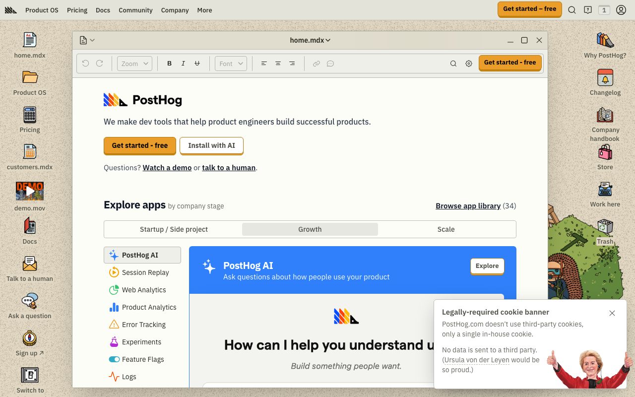
PostHog is unapologetically bold — yellow and blue create a high-contrast, memorable brand in the analytics space. The hedgehog mascot and irreverent copy signal a community-first culture, while the data interfaces stay clean and functional.
Key Characteristics:
- Yellow brand + cobalt blue for interactive elements
- Quirky personality with serious data chops
- MatterSQ typeface for a distinctive editorial feel
- Dark mode as first-class citizen
2. Color Palette & Roles
Primary
- Brand Yellow (
#F9BD2B): Brand moments, highlights, mascot accents - Interactive Blue (
#1D4AFF): CTAs, links, chart primary series
Accent Colors
- Purple (
#7C3AED): Feature flags, experiments - Teal (
#13BEF9): Session replays, paths
Neutral Scale
- Text Primary (
#1D1D1D): Light mode body - Text Primary Dark (
#EEEFE9): Dark mode body - Text Secondary (
#6B7280): Metadata, labels
Surface & Borders
- Background Light (
#F9F9F9): Light mode bg - Background Dark (
#151515): Dark mode bg - Surface (
#FFFFFF): Cards (light),#1D1D1D(dark) - Border (
#E5E7EB): Dividers
Semantic / Status
- Success (
#22C55E): Goals met, experiments won - Danger (
#F54E00): Errors, failed tests - Warning (
#F9BD2B): At-risk metrics (uses brand yellow)
3. Typography Rules
Font Family
Primary: MatterSQ, fallback: -apple-system, sans-serif. Code: Fira Code
Hierarchy
| Role | Font | Size | Weight | Line Height | Letter Spacing | Notes |
|---|---|---|---|---|---|---|
| Display | MatterSQ | 52px | 700 | 1.1 | -0.02em | Marketing hero |
| H1 | MatterSQ | 36px | 700 | 1.2 | -0.01em | Dashboard title |
| H2 | MatterSQ | 24px | 600 | 1.3 | 0 | Section headings |
| H3 | MatterSQ | 18px | 600 | 1.4 | 0 | Widget titles |
| Body | MatterSQ | 15px | 400 | 1.6 | 0 | UI body |
| Small | MatterSQ | 13px | 400 | 1.5 | 0 | Labels, meta |
| Code | Fira Code | 13px | 400 | 1.6 | 0 | Event names |
Principles
- MatterSQ has personality — use heavier weights for impact
- Never use yellow text on white — contrast fails
4. Component Stylings
Buttons
- Primary: bg
#1D4AFF, text#FFFFFF, padding9px 18px, radius4px, font 14px/600 - Secondary: bg
#FFFFFF, border1px solid #E5E7EB, text#1D1D1D - Danger: bg
#F54E00, text#FFFFFF
Cards & Containers
- Light: bg
#FFFFFF, border1px solid #E5E7EB, radius8px, padding16px - Dark: bg
#1D1D1D, border1px solid #2D2D2D
Inputs & Forms
- Border
1px solid #E5E7EB, radius4px, padding8px 12px - Focus: border
#1D4AFF
Navigation
- Left sidebar
#1D1D1D, 240px (dark always) - Top nav height 48px
5. Layout Principles
Spacing System
- 4px — Tight icon-label gaps
- 8px — List items, small padding
- 12px — Widget internal padding
- 16px — Card padding
- 24px — Section separation
- 32px — Dashboard row gaps
- 48px — Page-level sections
Grid & Container
- Dashboard: 12-column grid, 16px gutters, max width 1440px
- Widget grid with drag-to-resize
Whitespace Philosophy
Data is dense by necessity — use whitespace to group insight cards, not decorate.
Border Radius Scale
- None (0px): Table rows
- Sm (4px): Buttons, inputs, tags
- Md (8px): Cards, modals
- Full (9999px): Avatars, status pills
6. Depth & Elevation
| Level | Treatment | Use |
|---|---|---|
| Flat | none | Dashboard bg |
| Raised | 0 1px 4px rgba(0,0,0,0.08) | Insight cards |
| Overlay | 0 4px 12px rgba(0,0,0,0.15) | Dropdowns |
| Modal | 0 8px 32px rgba(0,0,0,0.2) | Dialogs |
7. Do's and Don'ts
Do
- Use yellow for brand and marketing moments
- Use blue for all product interactive elements
- Lean into the hedgehog personality in empty states
Don't
- Don't use yellow as a background fill — it drowns text
- Don't use more than 6 series colors in a single chart
- Don't override the dark sidebar with a light version
8. Responsive Behavior
Breakpoints
| Name | Width | Key Changes |
|---|---|---|
| Mobile | 0–767px | Single column, hidden sidebar |
| Tablet | 768–1023px | 2-column dashboard, icon nav |
| Desktop | 1024px+ | Full dashboard, sidebar visible |
Touch Targets
Minimum 44×44px. Dashboard widget controls are 36px with 4px padding zone.
Collapsing Strategy
Sidebar collapses to icon strip. Dashboard grid goes single column on mobile.
9. Agent Prompt Guide
Quick Color Reference
- Brand Accent: Yellow (
#F9BD2B) - Interactive/CTA: Blue (
#1D4AFF) - Background: Near-black (
#151515) dark / Off-white (#F9F9F9) light - Text:
#1D1D1D(light) or#EEEFE9(dark) - Error: Orange-red (
#F54E00)
Iteration Guide
- Yellow is brand, blue is interactive — never swap them
- Sidebar is always dark even in light mode
- MatterSQ has distinct letter shapes — use it at large sizes for impact
- Chart series colors start with blue, then purple, teal, yellow
- Empty states use the hedgehog illustration — never a generic icon