Replicate
Run AI with an API
CTAs, links, active states
Hover state
Model output indicators
Headings, body
Metadata, captions
Placeholders
Page background
Sidebar, table headers
Dividers, card borders
Successful predictions
Failed predictions
Running predictions
Pending
Design System Inspired by Replicate
1. Visual Theme & Atmosphere
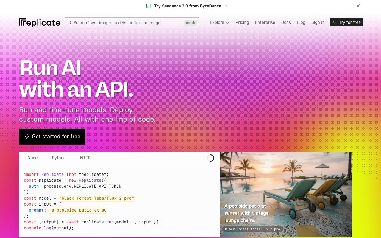
Replicate is an API-first ML model platform for engineers who want to run models in production. Crisp black on white with a bold indigo-blue accent signals developer credibility. Code examples are front-and-center — the UI exists to get you to the API as fast as possible.
Key Characteristics:
- Bold indigo-blue on white — crisp and developer-forward
- Code examples as primary UI content
- Inter for clean technical clarity
- Zero visual noise — function over aesthetics
2. Color Palette & Roles
Primary
- Indigo Blue (
#5555FF): CTAs, links, active states - Indigo Dark (
#3333DD): Hover state
Accent Colors
- Teal (
#00B4A0): Model output indicators
Neutral Scale
- Text Primary (
#111111): Headings, body - Text Secondary (
#6B7280): Metadata, captions - Text Muted (
#9CA3AF): Placeholders
Surface & Borders
- Background (
#FFFFFF): Page background - Code BG (
#111111): Code block background (dark) - Surface (
#F9FAFB): Sidebar, table headers - Border (
#E5E7EB): Dividers, card borders
Semantic / Status
- Success (
#10B981): Successful predictions - Error (
#EF4444): Failed predictions - Processing (
#5555FF): Running predictions - Queued (
#9CA3AF): Pending
3. Typography Rules
Font Family
Primary: Inter, fallback: system-ui, sans-serif. Code: Fira Mono
Hierarchy
| Role | Font | Size | Weight | Line Height | Letter Spacing | Notes |
|---|---|---|---|---|---|---|
| H1 | Inter | 40px | 700 | 1.1 | -0.02em | Page titles |
| H2 | Inter | 28px | 700 | 1.2 | -0.01em | Section headings |
| H3 | Inter | 20px | 600 | 1.3 | 0 | Card titles |
| Body | Inter | 16px | 400 | 1.6 | 0 | Prose |
| Small | Inter | 14px | 400 | 1.5 | 0 | Meta, labels |
| Code | Fira Mono | 14px | 400 | 1.6 | 0 | API examples |
Principles
- Show API code immediately — engineers assess the interface before the copy
- Fira Mono for all code; never use Inter in code blocks
4. Component Stylings
Buttons
- Primary: bg
#5555FF, text#FFFFFF, padding10px 20px, radius6px, font 15px/600 - Secondary: bg
#FFFFFF, border1px solid #E5E7EB, text#111111 - Copy: bg
#F3F4F6, text#111111, icon-only or short label
Cards & Containers
- bg
#FFFFFF, border1px solid #E5E7EB, radius8px, padding20px - Model card: name (owner/model format), run count badge, I/O type chips
Inputs & Forms
- Border
1px solid #E5E7EB, radius6px, padding10px 14px - Focus: border
#5555FF
Navigation
- Top nav
#FFFFFF, height 60px, border-bottom#E5E7EB
5. Layout Principles
Spacing System
- 4px — Tag gaps
- 8px — Stat spacing
- 12px — Badge padding
- 16px — Card padding
- 24px — Section gaps
- 32px — Feature blocks
- 48px — Page sections
- 64px — Hero spacing
Grid & Container
- Max width 1100px. Model browse: 3-column grid. Model page: 2-column (demo + code).
Whitespace Philosophy
Code examples need space to breathe — never compress API blocks.
Border Radius Scale
- None (0px): Code block edges
- Sm (4px): I/O type chips, version badge
- Md (6px): Buttons, inputs
- Lg (8px): Model cards
- Full (9999px): Avatars, status dots
6. Depth & Elevation
| Level | Treatment | Use |
|---|---|---|
| Flat | none | Page background |
| Raised | 0 1px 3px rgba(0,0,0,0.08) | Model cards |
| Overlay | 0 4px 12px rgba(0,0,0,0.12) | Dropdowns |
| Modal | 0 8px 32px rgba(0,0,0,0.15) | Dialogs |
7. Do's and Don'ts
Do
- Show code examples immediately on every model page
- Use indigo for all interactive elements
- Display owner/model name format (e.g. "stability-ai/sdxl")
Don't
- Don't bury the API endpoint — it should be scannable from the top
- Don't use gradients in the main UI
- Don't use light code blocks — code is always on dark (
#111111)
8. Responsive Behavior
Breakpoints
| Name | Width | Key Changes |
|---|---|---|
| Mobile | 0–767px | Single column, stacked code |
| Tablet | 768–1023px | 2-column browse |
| Desktop | 1024px+ | 3-column browse, 2-col model page |
Touch Targets
Minimum 44×44px. Copy button has 44px hit area.
Collapsing Strategy
Model demo and code stack vertically on mobile. Browse goes single column.
9. Agent Prompt Guide
Quick Color Reference
- CTA: Indigo Blue (
#5555FF) - Background: White (
#FFFFFF) - Text: Near-black (
#111111) - Code bg: Black (
#111111) - Border:
#E5E7EB - Running: Indigo (
#5555FF) - Success: Green (
#10B981)
Iteration Guide
- Code examples use dark bg (
#111111) even on a white page - Model names always use the owner/model slug format
- Input and output type chips (image, text, audio) appear on every card
- Copy button is always top-right of code blocks
- Run count badge is prominent — it signals community trust