Retool
Build internal tools remarkably fast
Run, deploy, primary actions
Hover state
Links, info states
All body and heading text
Labels, metadata
Placeholders, disabled
App background
Builder panels, sidebars
Dividers, input borders
Dark builder canvas option
Query success, deployed
Failed queries, errors
Slow queries, warnings
Design System Inspired by Retool
1. Visual Theme & Atmosphere
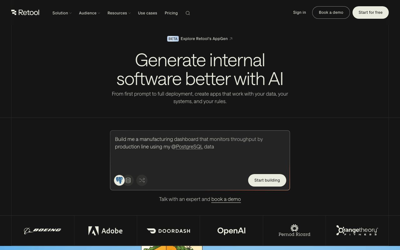
Retool is a low-code internal tool builder with a dual personality: the builder interface is dense and utilitarian, while finished apps should feel clean and purposeful. Orange energy on neutral gray makes the builder feel fast and powerful without being distracting.
Key Characteristics:
- Orange accent on neutral gray-and-white
- High density: every pixel earns its place
- Inter throughout — no-nonsense clarity
- Builder and runtime as distinct visual modes
2. Color Palette & Roles
Primary
- Orange Accent (
#FF5C35): Run, deploy, primary actions - Orange Dark (
#E54A25): Hover state
Accent Colors
- Blue (
#0070F3): Links, info states
Neutral Scale
- Text Primary (
#3D3D3D): All body and heading text - Text Secondary (
#6B6B6B): Labels, metadata - Text Muted (
#9CA3AF): Placeholders, disabled
Surface & Borders
- Background (
#FFFFFF): App background - Surface (
#F5F5F5): Builder panels, sidebars - Border (
#E2E2E2): Dividers, input borders - Builder BG (
#1E1E1E): Dark builder canvas option
Semantic / Status
- Success (
#22C55E): Query success, deployed - Error (
#EF4444): Failed queries, errors - Warning (
#F59E0B): Slow queries, warnings
3. Typography Rules
Font Family
Primary: Inter, fallback: system-ui, sans-serif. Code: Source Code Pro
Hierarchy
| Role | Font | Size | Weight | Line Height | Letter Spacing | Notes |
|---|---|---|---|---|---|---|
| H1 | Inter | 28px | 700 | 1.2 | -0.01em | Page/app titles |
| H2 | Inter | 20px | 600 | 1.3 | 0 | Section headings |
| H3 | Inter | 16px | 600 | 1.4 | 0 | Panel titles |
| Body | Inter | 14px | 400 | 1.6 | 0 | UI body |
| Small | Inter | 12px | 400 | 1.5 | 0 | Labels, meta |
| Button | Inter | 13px | 500 | 1 | 0.01em | CTAs |
| Code | Source Code Pro | 13px | 400 | 1.6 | 0 | Query editor |
Principles
- 14px is the canonical UI size — builder density demands it
- Code must always be monospace
4. Component Stylings
Buttons
- Primary: bg
#FF5C35, text#FFFFFF, padding7px 14px, radius4px, font 13px/500 - Secondary: bg
#FFFFFF, border1px solid #E2E2E2, text#3D3D3D - Danger: bg
#EF4444, text#FFFFFF
Cards & Containers
- bg
#FFFFFF, border1px solid #E2E2E2, radius4px, padding12px
Inputs & Forms
- Border
1px solid #E2E2E2, radius4px, padding6px 10px, font 13px - Focus: border
#FF5C35
Navigation
- Left builder panel
#2A2A2A, 240px, white icons - Properties panel right sidebar, 280px
5. Layout Principles
Spacing System
- 4px — Tight gaps, icon padding
- 8px — Panel item padding
- 12px — Component padding
- 16px — Section gaps
- 24px — Panel separation
- 32px — Major sections
Grid & Container
- Builder canvas: fluid. Apps: configurable grid (12 columns default, 8px cells).
Whitespace Philosophy
The builder is intentionally dense — every pixel saves a click.
Border Radius Scale
- None (0px): Canvas grid lines
- Sm (4px): Buttons, inputs, dropdowns, badges
- Md (6px): Component cards
- Full (9999px): Status pills
6. Depth & Elevation
| Level | Treatment | Use |
|---|---|---|
| Flat | none | Builder panels |
| Raised | 0 1px 3px rgba(0,0,0,0.1) | Floating components |
| Overlay | 0 4px 12px rgba(0,0,0,0.15) | Dropdowns, pickers |
| Modal | 0 8px 24px rgba(0,0,0,0.2) | Dialogs |
7. Do's and Don'ts
Do
- Use orange for execution actions (Run query, Deploy, Save)
- Keep builder and runtime visually distinct
- Show query execution time and row count after every run
Don't
- Don't use orange for destructive actions — use red
- Don't beautify the builder panel — density is the feature
- Don't animate within the canvas — builders need instant feedback
8. Responsive Behavior
Breakpoints
| Name | Width | Key Changes |
|---|---|---|
| Mobile | 0–767px | View-only mode, no builder |
| Tablet | 768–1023px | Simplified builder, collapsible panels |
| Desktop | 1024px+ | Full 3-panel builder |
Touch Targets
Minimum 44×44px in runtime apps. Builder is desktop-only.
Collapsing Strategy
Builder panels collapse to icon strips. Runtime apps follow their configured layout.
9. Agent Prompt Guide
Quick Color Reference
- Primary Action: Orange (
#FF5C35) - Background: White (
#FFFFFF) - Builder Panel: Dark (
#2A2A2A) - Text: Charcoal (
#3D3D3D) - Border: Light Gray (
#E2E2E2) - Success: Green (
#22C55E)
Iteration Guide
- Orange is for execution/saving — not navigation or brand moments
- Builder uses dark bg (
#2A2A2A), runtime uses white - All font sizes are 13–14px — never 16px in builder UI
- Query results show in a table below the editor, always
- Radius is uniformly 4px — no variation across components