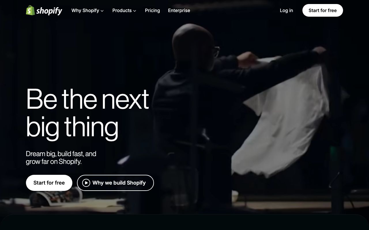
Shopify
Making commerce better for everyone
CTAs, active states, success
Hover states, pressed buttons
Links, informational elements
Body and heading text
Captions, metadata
Disabled labels
Page background
Cards, panels
Input borders, dividers
Section dividers
Success banners
Warning states
Errors, destructive actions
Info callouts
Design System Inspired by Shopify
1. Visual Theme & Atmosphere
Shopify's design system (Polaris) communicates trust, commerce, and growth. Forest green anchors every surface with the warmth of a thriving business, while neutral grays keep the focus on merchants' products. The aesthetic is clean and professional — never flashy, always purposeful.
Key Characteristics:
- Forest green primary paired with near-white surfaces
- Generous whitespace, 8px base grid
- Friendly but authoritative typography
- Flat design with minimal shadows
2. Color Palette & Roles
Primary
- Brand Green (
#008060): CTAs, active states, success - Dark Green (
#004C3F): Hover states, pressed buttons
Accent Colors
- Interactive Blue (
#0070D9): Links, informational elements
Neutral Scale
- Text Primary (
#202223): Body and heading text - Text Secondary (
#6D7175): Captions, metadata - Text Disabled (
#8C9196): Disabled labels
Surface & Borders
- Background (
#F6F6F7): Page background - Surface (
#FFFFFF): Cards, panels - Border (
#C9CCCF): Input borders, dividers - Border Subdued (
#E4E5E7): Section dividers
Semantic / Status
- Success (
#008060): Success banners - Warning (
#FFC453): Warning states - Critical (
#D72C0D): Errors, destructive actions - Highlight (
#EAF4FB): Info callouts
3. Typography Rules
Font Family
Primary: ShopifySans (custom), fallback: -apple-system, BlinkMacSystemFont, sans-serif
Hierarchy
| Role | Font | Size | Weight | Line Height | Letter Spacing | Notes |
|---|---|---|---|---|---|---|
| Display | ShopifySans | 40px | 700 | 1.1 | -0.02em | Hero headings |
| H1 | ShopifySans | 28px | 700 | 1.2 | -0.01em | Page titles |
| H2 | ShopifySans | 20px | 600 | 1.3 | 0 | Section headings |
| H3 | ShopifySans | 16px | 600 | 1.4 | 0 | Card titles |
| Body | ShopifySans | 14px | 400 | 1.6 | 0 | Primary content |
| Caption | ShopifySans | 12px | 400 | 1.5 | 0.01em | Labels, metadata |
| Button | ShopifySans | 14px | 500 | 1 | 0.01em | CTA labels |
| Code | Menlo, Monaco | 13px | 400 | 1.6 | 0 | Code snippets |
Principles
- Merchant-first clarity — no jargon, no decoration
- Consistent 14px body keeps the UI compact for data-heavy dashboards
4. Component Stylings
Buttons
- Primary: bg
#008060, text#FFFFFF, padding8px 16px, radius4px, font 14px/500 - Secondary: bg
#FFFFFF, border1px solid #C9CCCF, text#202223 - Destructive: bg
#D72C0D, text#FFFFFF - Plain: bg
transparent, text#008060, no border
Cards & Containers
- bg
#FFFFFF, border1px solid #E4E5E7, radius8px, padding20px
Inputs & Forms
- Border
1px solid #C9CCCF, radius4px, padding8px 12px, font 14px - Focus: border
#008060, ring0 0 0 2px rgba(0,128,96,0.2)
Navigation
- Left sidebar
#1A1A1Abg, 240px wide, white text - Top bar
#FFFFFF, height 56px, border-bottom#E4E5E7
5. Layout Principles
Spacing System
- 4px — Tight inline gaps (icon-label)
- 8px — List item padding, small gaps
- 12px — Input internal padding
- 16px — Card padding, form field gaps
- 20px — Card content padding
- 24px — Section gaps
- 32px — Major component separation
- 40px — Page section breaks
Grid & Container
- Max width 1200px, centered. 12-column grid, 16px gutters
- Sidebar layout: fixed 240px left nav + fluid content area
Whitespace Philosophy
Merchant dashboards are data-dense; whitespace is functional, not decorative.
Border Radius Scale
- None (0px): Table rows, full-width banners
- Sm (4px): Inputs, buttons, badges, tags
- Md (8px): Cards, modals, popovers
- Lg (12px): Feature cards
- Full (9999px): Avatar rings, pill badges
6. Depth & Elevation
| Level | Treatment | Use |
|---|---|---|
| Flat | none | Page surfaces, table rows |
| Raised | 0 1px 0 rgba(22,29,37,0.05) | Cards |
| Overlay | 0 4px 8px rgba(0,0,0,0.1), 0 2px 4px rgba(0,0,0,0.06) | Dropdowns |
| Modal | 0 8px 24px rgba(0,0,0,0.15) | Modals, sheets |
7. Do's and Don'ts
Do
- Use green exclusively for positive actions and success states
- Keep forms simple — one column, clear labels above fields
- Use Polaris components as-is; customise only via tokens
Don't
- Don't use red for anything other than destructive/error states
- Don't build custom components that duplicate Polaris patterns
- Don't exceed two levels of nesting in navigation
8. Responsive Behavior
Breakpoints
| Name | Width | Key Changes |
|---|---|---|
| Mobile | 0–767px | Single column, hidden sidebar, stacked cards |
| Tablet | 768–1023px | 2-column layout, collapsible nav |
| Desktop | 1024px+ | Full sidebar + content area |
Touch Targets
Minimum 44×44px for all interactive elements.
Collapsing Strategy
Sidebar collapses to hamburger on mobile. Cards stack vertically. Data tables become scrollable.
9. Agent Prompt Guide
Quick Color Reference
- Primary CTA: Brand Green (
#008060) - Background: Page Gray (
#F6F6F7) - Surface: White (
#FFFFFF) - Heading text: Near-black (
#202223) - Border: Mid-gray (
#C9CCCF) - Error: Critical Red (
#D72C0D)
Iteration Guide
- Always use ShopifySans (or system-ui fallback); never Georgia or decorative fonts
- Buttons are radius-4px — Shopify uses tighter radius than most SaaS
- Data tables have no outer border — rely on row separators only
- Green is reserved for positive actions — use blue for informational links
- All form labels sit above the field, never inline or placeholder-only