Supabase
The open source Firebase alternative
13 colors
20 components
Inter, Source Code Pro
Mar 19, 2026
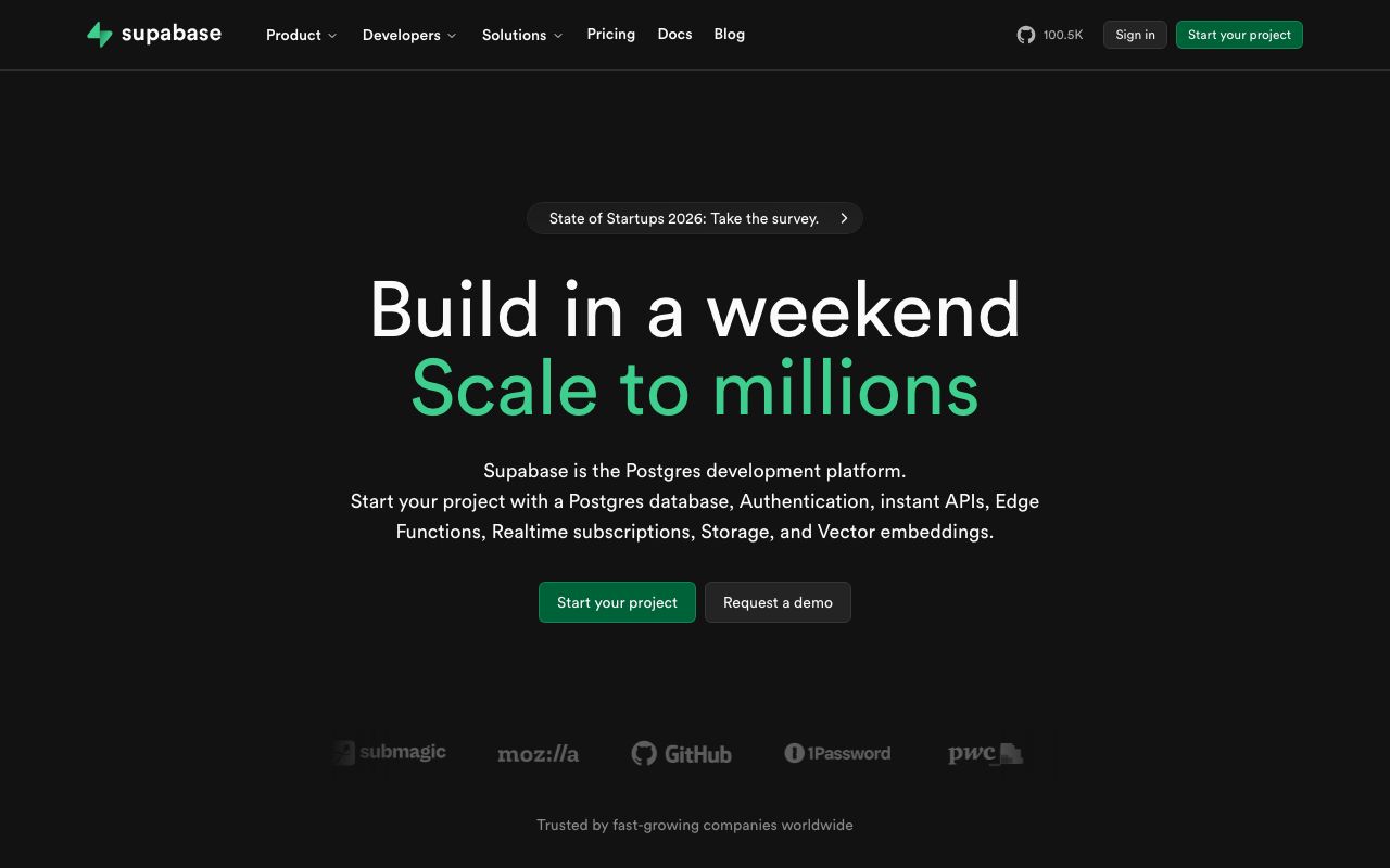
Website Preview
Colors
Primary
#3ECF8E
Primary accent, CTAs
#1C1C1C
Page background
#2E2E2E
Cards, panels
#EDEDED
Primary text
#333333
Borders
Neutral
#1C1C1C
Base background
#2E2E2E
Card surface
#333333
Borders, dividers
#888888
Muted text
#EDEDED
Primary text
Semantic
#3ECF8E
Success states, active connections
#F66061
Error states, failed queries
#F4BD50
Warning alerts
Typography
Inter
Role
SizeWeightHeight
Display
48px7001.1
Heading
32px6001.2
Body
16px4001.6
Small
14px4001.5
Source Code Pro
Role
SizeWeightHeight
Code
14px4001.6
DESIGN.md — Supabase
Overview
Supabase pairs developer-centric dark interfaces with its signature emerald green accent. The design system communicates open-source ethos through clean technical aesthetics and generous use of code-style elements.
Colors
Primary Palette
| Token | Hex | Usage |
|---|---|---|
color-brand | #3ECF8E | Primary accent, CTAs |
color-bg | #1C1C1C | Page background |
color-surface | #2E2E2E | Cards, panels |
color-text | #EDEDED | Primary text |
color-border | #333333 | Borders |
Neutral Palette
| Token | Hex | Usage |
|---|---|---|
color-gray-900 | #1C1C1C | Base background |
color-gray-800 | #2E2E2E | Card surface |
color-gray-700 | #333333 | Borders, dividers |
color-gray-400 | #888888 | Muted text |
color-gray-100 | #EDEDED | Primary text |
Semantic Colors
| Token | Hex | Usage |
|---|---|---|
color-success | #3ECF8E | Success states, active connections |
color-error | #F66061 | Error states, failed queries |
color-warning | #F4BD50 | Warning alerts |
Typography
| Role | Family | Size | Weight | Line Height |
|---|---|---|---|---|
| Display | Inter | 48px | 700 | 1.1 |
| Heading | Inter | 32px | 600 | 1.2 |
| Body | Inter | 16px | 400 | 1.6 |
| Small | Inter | 14px | 400 | 1.5 |
| Code | Source Code Pro | 14px | 400 | 1.6 |
Spacing
| Token | Value | Usage |
|---|---|---|
space-1 | 4px | Icon gaps |
space-2 | 8px | List item padding |
space-4 | 16px | Card padding |
space-6 | 24px | Section gaps |
space-8 | 32px | Panel padding |
Border Radius
| Token | Value | Usage |
|---|---|---|
radius-sm | 4px | Badges, tags |
radius-md | 6px | Buttons, inputs |
radius-lg | 8px | Cards, panels |
radius-xl | 12px | Modals |
Elevation
| Level | Value | Usage |
|---|---|---|
shadow-sm | 0 1px 3px rgba(0,0,0,0.3) | Cards at rest |
shadow-md | 0 4px 16px rgba(0,0,0,0.4) | Dropdowns |
shadow-lg | 0 8px 32px rgba(0,0,0,0.5) | Modals |
Components
Dashboard Panel
- Dark card with
#2E2E2Ebg, 1px#333border - Header with title + action buttons
- Tabbed content areas
SQL Editor
- Full-width code editor with syntax highlighting
- Run button in emerald green
- Results table below
Auth UI
- Pre-built sign-in/sign-up components
- Social provider buttons
- Consistent with dashboard dark theme
Do's and Don'ts
Do
- Use emerald green for positive/active states only
- Maintain dark-first design in all surfaces
- Include code examples with syntax highlighting
Don't
- Don't use the green accent for destructive actions
- Don't lighten the background above
#2E2E2E - Don't use serif fonts anywhere