Twitch
Interactive live streaming
13 colors
19 components
Roobert
Apr 3, 2026
Website Preview
Colors
Primary
#9146FF
Brand purple, primary CTAs
#18181B
App background
#EFEFF1
Primary text
#26262C
Cards, panels
#53535F
Secondary text, borders
Neutral
#18181B
App background
#1F1F23
Panel surfaces
#26262C
Card background
#53535F
Borders
#ADADB8
Subdued text
Semantic
#EB0400
Live indicator badge
#00C8AF
Subscription, bits success
#9146FF
Subscription state (reuses brand)
Typography
Roobert
Role
SizeWeightHeight
Display
48px7001.1
Heading
24px6001.2
Body
14px4001.5
Chat
13px4001.5
DESIGN.md — Twitch
Overview
Twitch's design system is built for live entertainment. The iconic purple permeates every interaction — from the brand mark to CTAs to the chat experience. Dark surfaces keep the focus on video content, while bright accents and animations inject the energy of live streaming.
Colors
Primary Palette
| Token | Hex | Usage |
|---|---|---|
color-brand | #9146FF | Brand purple, primary CTAs |
color-bg | #18181B | App background |
color-text | #EFEFF1 | Primary text |
color-surface | #26262C | Cards, panels |
color-muted | #53535F | Secondary text, borders |
Neutral Palette
| Token | Hex | Usage |
|---|---|---|
color-dark-950 | #18181B | App background |
color-dark-800 | #1F1F23 | Panel surfaces |
color-dark-700 | #26262C | Card background |
color-dark-500 | #53535F | Borders |
color-text-muted | #ADADB8 | Subdued text |
Semantic Colors
| Token | Hex | Usage |
|---|---|---|
color-live | #EB0400 | Live indicator badge |
color-success | #00C8AF | Subscription, bits success |
color-sub | #9146FF | Subscription state (reuses brand) |
Typography
| Role | Family | Size | Weight | Line Height |
|---|---|---|---|---|
| Display | Roobert | 48px | 700 | 1.1 |
| Heading | Roobert | 24px | 600 | 1.2 |
| Body | Roobert | 14px | 400 | 1.5 |
| Chat | Roobert | 13px | 400 | 1.5 |
Spacing
| Token | Value | Usage |
|---|---|---|
space-1 | 4px | Chat inline gaps |
space-2 | 8px | Card inner spacing |
space-3 | 12px | Panel padding |
space-4 | 16px | Grid gap |
space-6 | 24px | Section gaps |
Border Radius
| Token | Value | Usage |
|---|---|---|
radius-sm | 4px | Live badge, tags |
radius-md | 6px | Buttons |
radius-lg | 9px | Cards, stream thumbnails |
radius-full | 9999px | Avatars |
Elevation
| Level | Value | Usage |
|---|---|---|
shadow-sm | 0 1px 4px rgba(0,0,0,0.4) | Cards |
shadow-md | 0 4px 16px rgba(145,70,255,0.2) | Hovered elements |
shadow-lg | 0 8px 32px rgba(0,0,0,0.6) | Modals |
Components
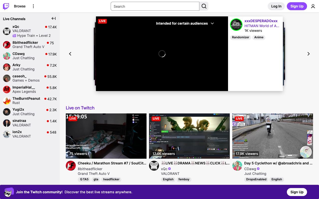
Stream Card
- Thumbnail with live viewer count badge
- Streamer name, game category, tags
- Hover auto-plays preview with audio muted
Chat Panel
- Right sidebar, dark bg, scrolling messages
- Username in color, message in white
- Emote integration inline with text
- Chat input at bottom with emote picker
Follow Button
- Purple bg, white heart icon + text
- Toggles to outlined "Following" state
- Pulse animation on follow
Do's and Don'ts
Do
- Use purple as the dominant brand accent
- Prioritize video content — dark UI recedes behind streams
- Support emotes as first-class UI elements in chat
Don't
- Don't use light backgrounds for the main app shell
- Don't reduce chat font size below 13px
- Don't delay live content for animations