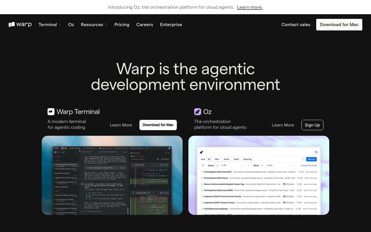
Warp
The terminal reimagined with AI
CTAs, active blocks, AI highlights
Hover state
Workflow and notebook elements
Terminal output, UI text
Timestamps, secondary labels
Disabled, placeholder
Terminal background
Input blocks, panels
Selected blocks
Block separators
Exit code 0, command success
Exit code >0, command failure
Non-fatal warnings in output
AI-generated content indicator
Design System Inspired by Warp
1. Visual Theme & Atmosphere
Warp reimagines the terminal with a modern product design sensibility. Bright cyan-blue on dark surfaces creates the expected terminal aesthetic while signalling that this is something fundamentally new. Warp bridges CLI and GUI — blocks, AI completions, and collaborative notebooks.
Key Characteristics:
- Cyan-blue on near-black — familiar terminal with a modern edge
- Block-based output as the core metaphor
- Hack monospace for terminal content, Inter for product UI
- Two visual layers: terminal canvas + product chrome
2. Color Palette & Roles
Primary
- Cyan Blue (
#01A4FF): CTAs, active blocks, AI highlights - Cyan Dark (
#0088D4): Hover state
Accent Colors
- Purple (
#9B59B6): Workflow and notebook elements
Neutral Scale
- Text Primary (
#F0F0F0): Terminal output, UI text - Text Secondary (
#9CA3AF): Timestamps, secondary labels - Text Muted (
#6B7280): Disabled, placeholder
Surface & Borders
- Background (
#0E0E10): Terminal background - Surface (
#1E1E22): Input blocks, panels - Surface Raised (
#28282E): Selected blocks - Border (
#333338): Block separators
Semantic / Status
- Success (
#22C55E): Exit code 0, command success - Error (
#EF4444): Exit code >0, command failure - Warning (
#F59E0B): Non-fatal warnings in output - AI Highlight (
#01A4FF): AI-generated content indicator
3. Typography Rules
Font Family
Terminal: Hack, fallback: Menlo, monospace. UI chrome: Inter, fallback: system-ui
Hierarchy
| Role | Font | Size | Weight | Line Height | Letter Spacing | Notes |
|---|---|---|---|---|---|---|
| Heading | Inter | 22px | 600 | 1.3 | 0 | Panel headings |
| Body UI | Inter | 14px | 400 | 1.5 | 0 | Product chrome |
| Terminal | Hack | 14px | 400 | 1.5 | 0 | All terminal content |
| AI Output | Inter | 14px | 400 | 1.6 | 0 | AI explanations |
| Small | Inter | 12px | 400 | 1.4 | 0 | Timestamps |
Principles
- Terminal canvas always uses monospace — no exceptions
- Product chrome (panels, modals) uses Inter
4. Component Stylings
Buttons
- Primary: bg
#01A4FF, text#FFFFFF, padding8px 16px, radius6px, font 14px/600 - Secondary: bg
transparent, border1px solid #333338, text#F0F0F0 - Ghost: bg
transparent, text#9CA3AF, hover text#F0F0F0
Cards & Containers
- bg
#1E1E22, border1px solid #333338, radius6px, padding16px - Selected block: left border 2px
#01A4FF
Inputs & Forms
- bg
#1E1E22, border1px solid #333338, radius6px, padding8px 12px, font Hack 14px - Focus: border
#01A4FF
Navigation
- Tab bar at top,
#0E0E10bg, height 36px - Command palette triggered by Ctrl+P
5. Layout Principles
Spacing System
- 4px — Block border width
- 8px — Block padding
- 12px — Panel padding
- 16px — Section gaps
- 24px — Terminal pane separation
- 32px — Panel sections
Grid & Container
- Terminal: fluid width, fills window. Panels: fixed 320px right sidebar.
Whitespace Philosophy
Terminal output is dense by nature — whitespace only in product chrome.
Border Radius Scale
- None (0px): Terminal canvas itself
- Sm (4px): Status chips, exit code badges
- Md (6px): Buttons, product UI elements
- Lg (8px): Workflow cards, modals
- Full (9999px): Session avatars
6. Depth & Elevation
| Level | Treatment | Use |
|---|---|---|
| Flat | none | Terminal canvas |
| Raised | 0 0 0 1px rgba(255,255,255,0.06) | Selected blocks |
| Overlay | 0 4px 16px rgba(0,0,0,0.5) | Command palette |
| Modal | 0 8px 32px rgba(0,0,0,0.6) | Workflows panel |
7. Do's and Don'ts
Do
- Use cyan blue to distinguish Warp product UI from terminal output
- Group command + output into a single selectable block
- Respect standard terminal ANSI color conventions in output
Don't
- Don't use proportional fonts in the terminal canvas
- Don't animate terminal output — it should render instantly
- Don't style terminal output text with product colors
8. Responsive Behavior
Breakpoints
| Name | Width | Key Changes |
|---|---|---|
| Mobile | 0–767px | Not supported (desktop app) |
| Tablet | 768–1023px | Single pane, no split view |
| Desktop | 1024px+ | Full split pane, panels |
Touch Targets
Desktop-optimised. Minimum 44×44px for all product UI buttons.
Collapsing Strategy
Split panes merge to single pane below 1024px. Right panels collapse.
9. Agent Prompt Guide
Quick Color Reference
- Active/CTA: Cyan Blue (
#01A4FF) - Background: Near-black (
#0E0E10) - Block surface:
#1E1E22 - Terminal text:
#F0F0F0 - Success (exit 0): Green (
#22C55E) - Error (exit >0): Red (
#EF4444)
Iteration Guide
- Never use proportional fonts inside the terminal canvas
- Block selection shows a cyan left border, not a background fill
- AI-generated suggestions use cyan bg at 10% opacity
- ANSI colors in terminal output must follow standard conventions
- Product chrome and terminal canvas are visually distinct layers